
Why the Psychology of Thumbnails Matters More Than Your Video Itself
Here’s a hard truth many creators don’t like hearing:
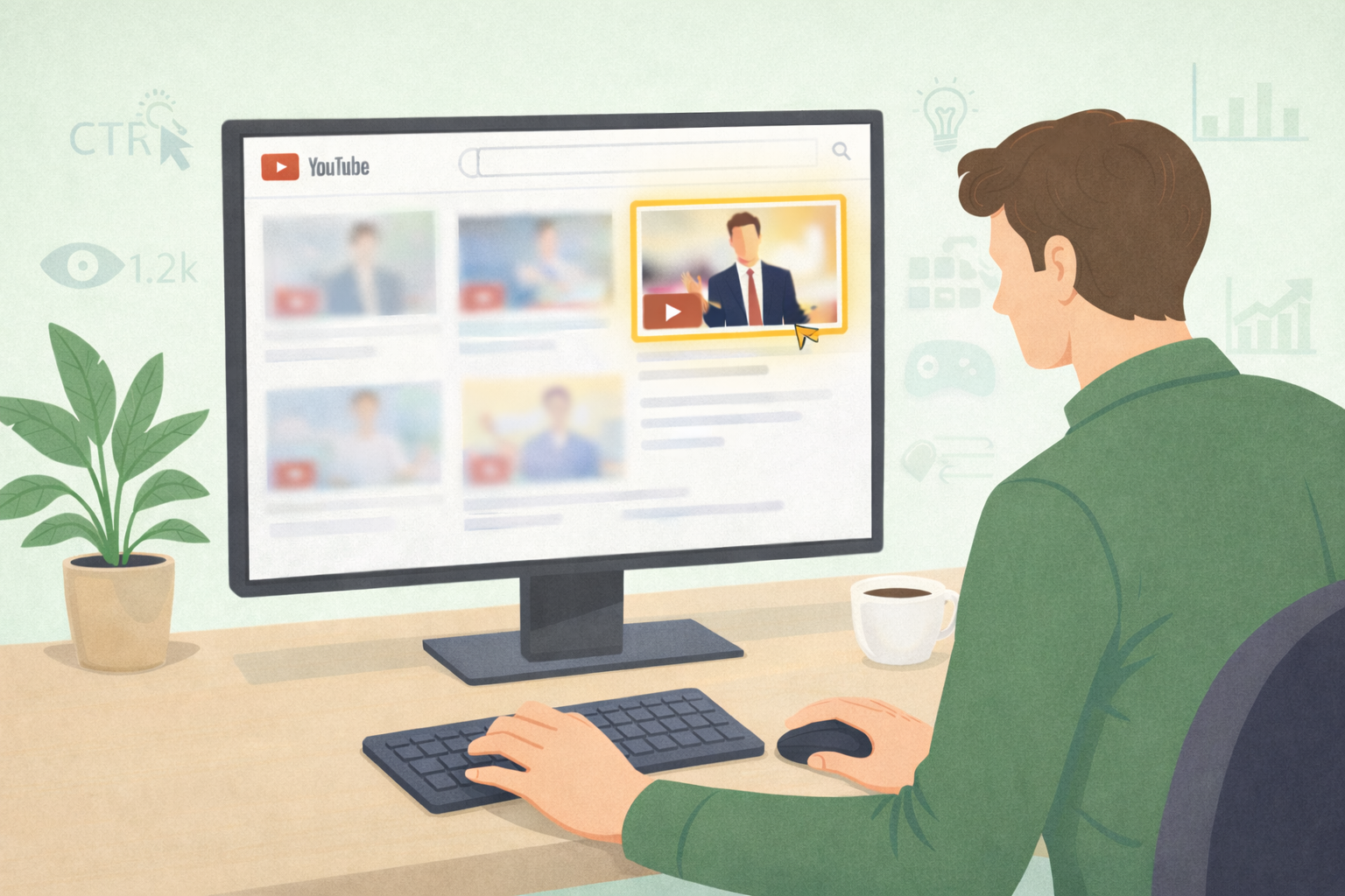
People don’t judge your video by its content. They judge it by the thumbnail.
Before a viewer hears your voice, reads your title, or understands your topic, they see one small image. That image decides everything.
 A well-designed thumbnail can double or even triple your click-through rate (CTR). Higher CTR means:
- More visibility in search
- More recommendations
- More appearances in subscriber feeds
That’s why 90% of the best-performing videos on YouTube use custom thumbnails.
This is the real power of thumbnail psychology:
You can transform your channel’s performance without changing a single frame of your actual video.
The Psychology of Thumbnails and First Impressions
A thumbnail is often your first—and sometimes only—chance to grab attention. In a fast-scrolling environment like YouTube, viewers don’t arrive with patience. They arrive with momentum. Your thumbnail has to interrupt that momentum instantly.
Psychologically, first impressions happen extremely fast—much faster than we consciously realize. Research shows the human brain can recognize and process an image in as little as 13 milliseconds. That’s faster than reading even a single word of text. This is exactly why thumbnails matter more than titles in the very first moment of exposure.

Before a viewer reads your title or understands your topic, their brain has already made a snap judgment based on the thumbnail alone. In that split second, the mind subconsciously asks a few critical questions:
- Is this relevant to me?
- Is this worth my time right now?
- Do I trust the person who made this?
What’s important to understand is that these questions aren’t asked logically. They’re answered emotionally. The brain uses shortcuts—visual cues, familiarity, and emotional signals—to decide whether to stop or keep scrolling.
This is why your YouTube thumbnail isn’t just visual flair or decoration. It’s a decision-making tool. It sets expectations. It signals quality. And it determines whether your video even gets a chance to be watched.
In a crowded feed where hundreds of options compete for attention, the thumbnail becomes your silent pitch. You don’t get a second chance at that first impression—and on YouTube, that first impression often is the whole battle.
How the Brain Processes Thumbnails Faster Than Text
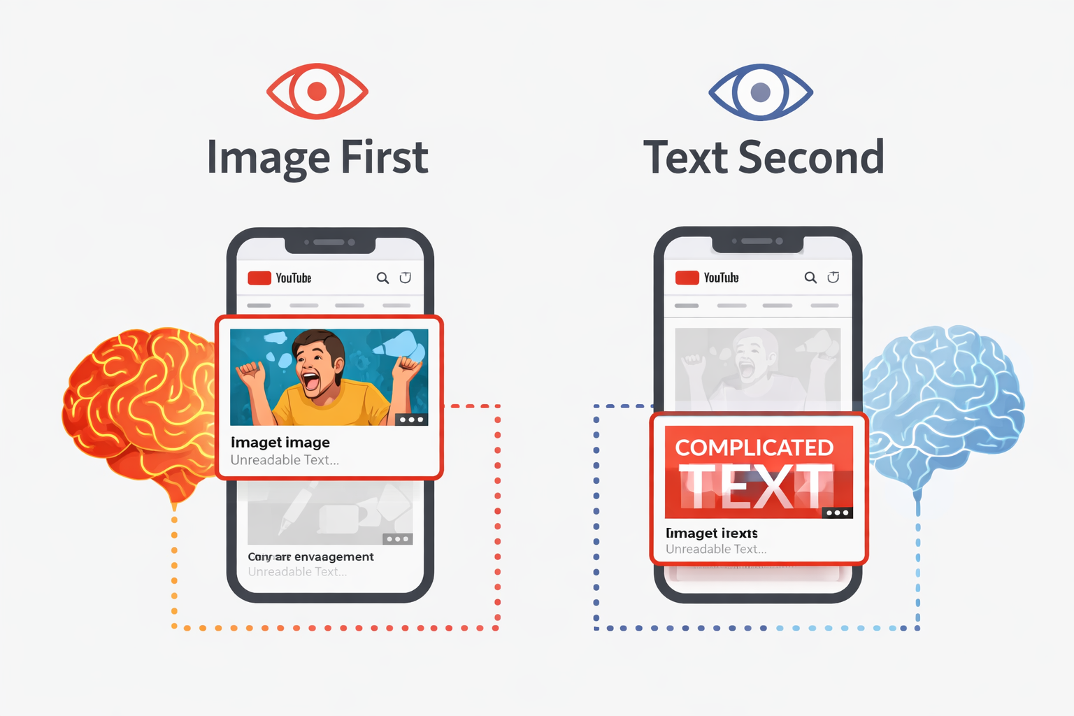
One of the most important principles in the psychology of thumbnails is simple but powerful: the brain processes images far faster than text.
Human vision evolved long before written language. Our brains are wired to scan visuals for meaning, danger, relevance, and emotion almost instantly. Text, on the other hand, requires conscious effort. It must be read, decoded, and understood. Images skip all of that.
That’s why thumbnails dominate attention in search results and recommended feeds. Even when a title is compelling, the thumbnail is what the eye lands on first—especially at the top of search results, where visual hierarchy gives thumbnails disproportionate attention.
This effect becomes even stronger on mobile devices. With over 70% of YouTube traffic now coming from mobile, small screens magnify every design mistake. There’s less space, less time, and less tolerance for clutter. If your thumbnail is busy, confusing, or hard to read at a glance, the brain simply moves on.
Mobile viewers aren’t analyzing thumbnails—they’re scanning them. That means:
- Strong contrast matters
- Clear subjects matter
- Simple composition matters
If your thumbnail can’t be understood instantly, it won’t be understood at all.
This is why effective thumbnails don’t try to explain everything. They communicate one clear idea visually. They make the brain’s job easy. And when the brain doesn’t have to work hard to understand something, it’s far more likely to reward it with attention—and a click.
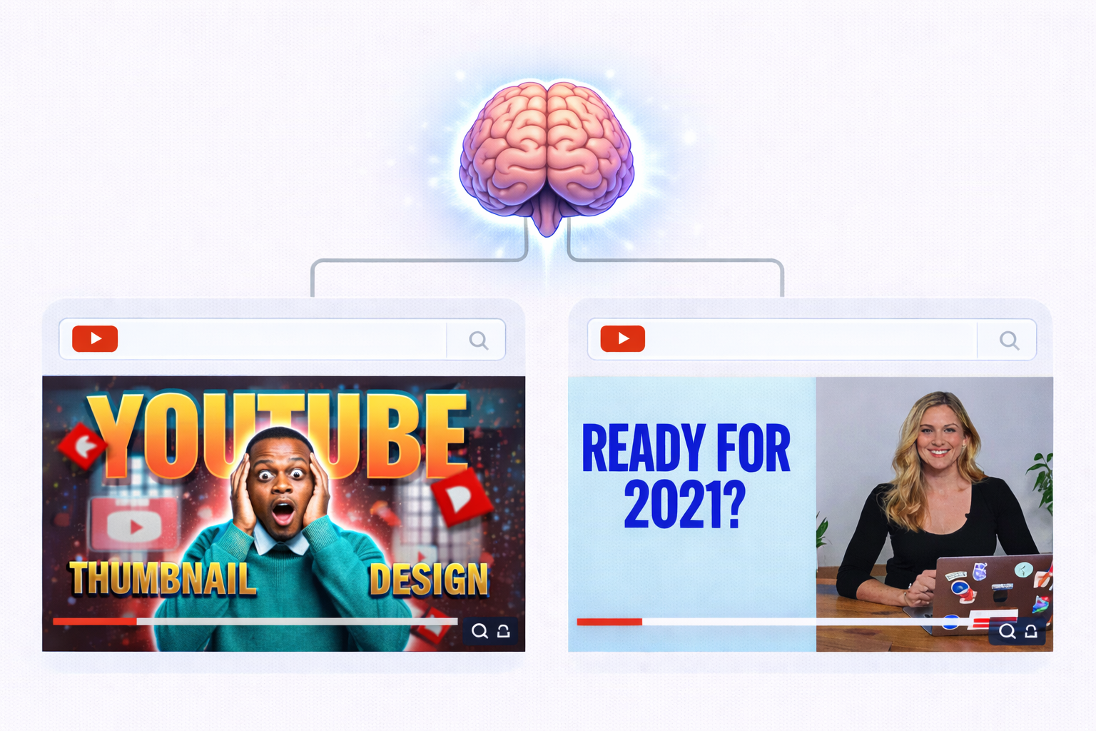
Why Faces Work So Well in Thumbnail Psychology
Humans are biologically hardwired to recognize faces. It’s evolutionary. Long before language, faces helped us detect emotion, intention, and safety. That wiring still controls how we behave online today.
This is why thumbnails featuring clear, expressive human faces consistently outperform thumbnails without them. Across creator studies and platform data, thumbnails with faces often see up to 20% higher click-through rates.
But here’s the key: not just any face works.
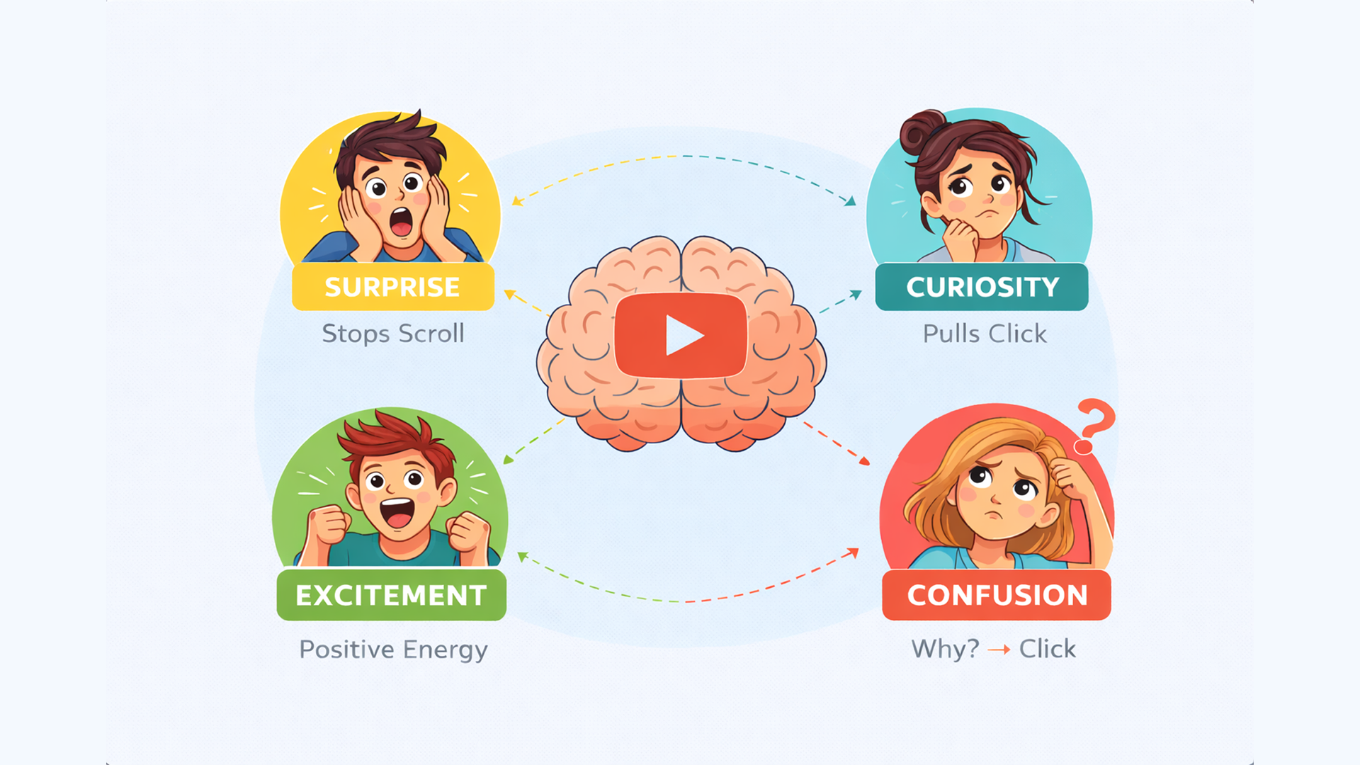
The psychology of thumbnails shows that specific emotions trigger stronger responses:
- Genuine surprise
- Curiosity
- Excitement
- Confusion
These expressions spark emotional resonance. They tell a story before a single word is spoken. When viewers see a real human reaction, their brain automatically tries to understand why that emotion exists—and clicking becomes the easiest way to find out.
Eye contact amplifies this effect even more. When a face in a thumbnail looks directly at the camera, it creates a sense of personal engagement. It feels like the creator is speaking directly to the viewer, not broadcasting to the internet.
Static objects, charts, or graphics rarely create this connection on their own. That’s why a thumbnail with a genuine human reaction often beats a perfectly designed graphic.
Authenticity matters here. Overly fake or exaggerated expressions can break trust. But real emotion captured honestly, activates deep psychological instincts that stop the scroll and invite the click.
The Curiosity Gap: Click Psychology Without Clickbait
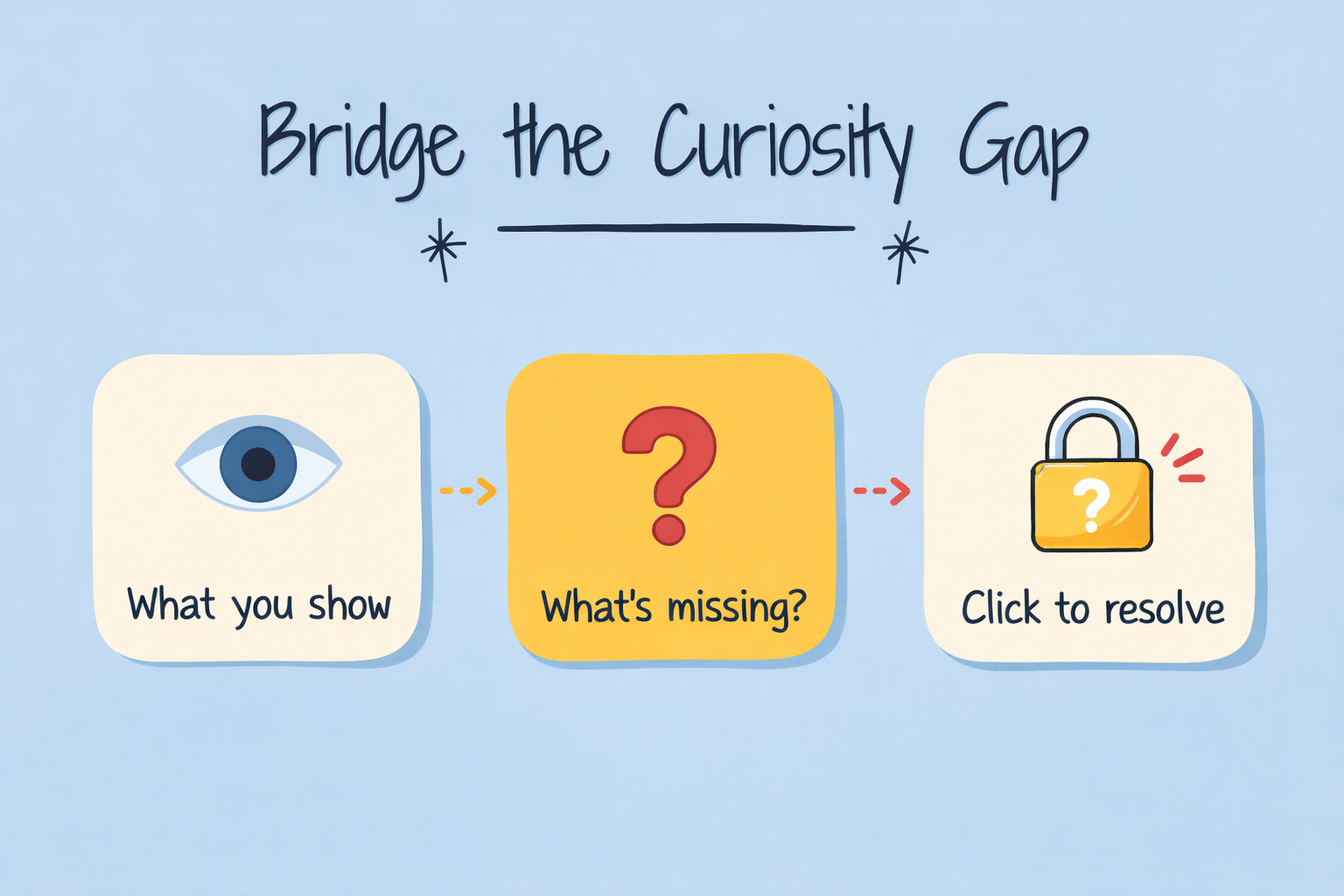
Humans have a deep psychological need to resolve uncertainty. When something feels incomplete, the brain wants closure. Psychologists call this the curiosity gap, and it’s one of the most powerful forces behind clicking behavior.
When a thumbnail hints at something missing—an unanswered question, an unseen result, a transformation not yet revealed—the brain feels a subtle tension. Clicking becomes the fastest way to release that tension.
But here’s the critical distinction:
Curiosity is not clickbait.
Clickbait lies. Curiosity promises something specific and delivers it in the video.
Effective curiosity gaps don’t exaggerate or mislead. They:
- Tease a transformation (“Before vs After”)
- Suggest missing information (“Most people get this wrong”)
- Hint at an outcome without fully revealing it
Text overlays can amplify this effect when used sparingly. Short phrases that imply discovery or change work best—but only if the video genuinely delivers on that promise.
The psychology of thumbnails teaches us that people don’t mind not knowing everything upfront. What they do mind is being tricked. Ethical curiosity respects the viewer’s intelligence while still giving them a reason to click.
When done right, curiosity doesn’t damage trust—it strengthens it. Viewers learn that clicking your thumbnails leads to real value, not disappointment.
Why Simplicity Wins in Thumbnail Psychology
Cognitive overload is one of the fastest ways to kill click-through rates.
The human brain doesn’t want to decode your thumbnail. It doesn’t want to analyze layers, read paragraphs, or figure out what’s happening. It wants instant understanding.
The psychology of thumbnails shows that the most effective thumbnails communicate one clear idea:
- One emotion
- One promise
- One visual focus
When too many elements compete for attention—multiple faces, too much text, busy backgrounds—the brain gives up. And when the brain gives up, the thumb keeps scrolling.
This is why clean thumbnails consistently outperform busy ones, especially in crowded niches. Simplicity reduces decision fatigue. It tells the viewer, “This will be easy to understand.”
Good thumbnails don’t explain the whole video. They spark interest and create clarity at the same time. If someone has to “figure out” what your thumbnail means, they’ll skip it—no matter how good your content is.
Standing Out in Crowded Niches with Thumbnail Psychology
In competitive niches like business, SaaS, or B2B content, thumbnails are often the only visual differentiator. Most videos cover similar topics, use similar titles, and target similar audiences. That makes the thumbnail the deciding factor.

Whether you’re an explainer video company, creating a SaaS explainer video, or producing a B2B explainer video, your thumbnail must answer three questions instantly:
- What is this video about?
- Why is it different from the rest?
- Why should I click it now?
Strong thumbnails help videos rank higher in search and recommended feeds—not because of design alone, but because higher click-through rates feed the algorithm. YouTube promotes what people choose to click.
In crowded niches, clarity beats cleverness. Viewers don’t want to guess. They want reassurance that clicking your video is a good use of their time.
Psychologically, thumbnails that reduce uncertainty perform better. They signal relevance, competence, and confidence. This is especially important for educational or professional content, where trust matters as much as curiosity.
If your thumbnail looks generic, your video feels generic—even if the content isn’t. Thumbnail psychology gives you a way to stand out visually before you ever get a chance to speak.
Consistency, Branding, and Trust in Thumbnails
Here’s something many creators overlook:
Once someone enjoys your video, they’re far more likely to click again if they recognize your style.
Consistency creates trust.
Viewers often recognize a thumbnail style before they read the title. Over time, the brain associates familiar visual patterns with positive experiences. That recognition reduces hesitation and speeds up the decision to click.

Top creators develop signature elements that repeat across thumbnails:
- Consistent color palettes
- Similar framing or composition
- Recognizable fonts
- Repeating layout structures
This is why branding isn’t just for big channels or the best explainer video companies. It turns casual viewers into loyal subscribers.
Consistency also makes your content feel professional. It signals effort, intention, and reliability. When viewers know what to expect visually, they’re more comfortable clicking again.
From a psychological perspective, familiarity lowers resistance. The brain trusts what it recognizes.
You don’t need complex branding systems—just a repeatable visual language. Over time, your thumbnails become recognizable even at a glance, and that recognition compounds into long-term growth.
Urgency, Value, and Emotional Triggers
Certain psychological signals consistently drive clicks because they tap into core human motivations.
Thumbnails that suggest “You’re missing something important” create urgency. Promises of quick value—like saving time, effort, or money—activate efficiency-seeking behavior. Faces showing unexpected or exaggerated emotion trigger curiosity and emotional engagement.
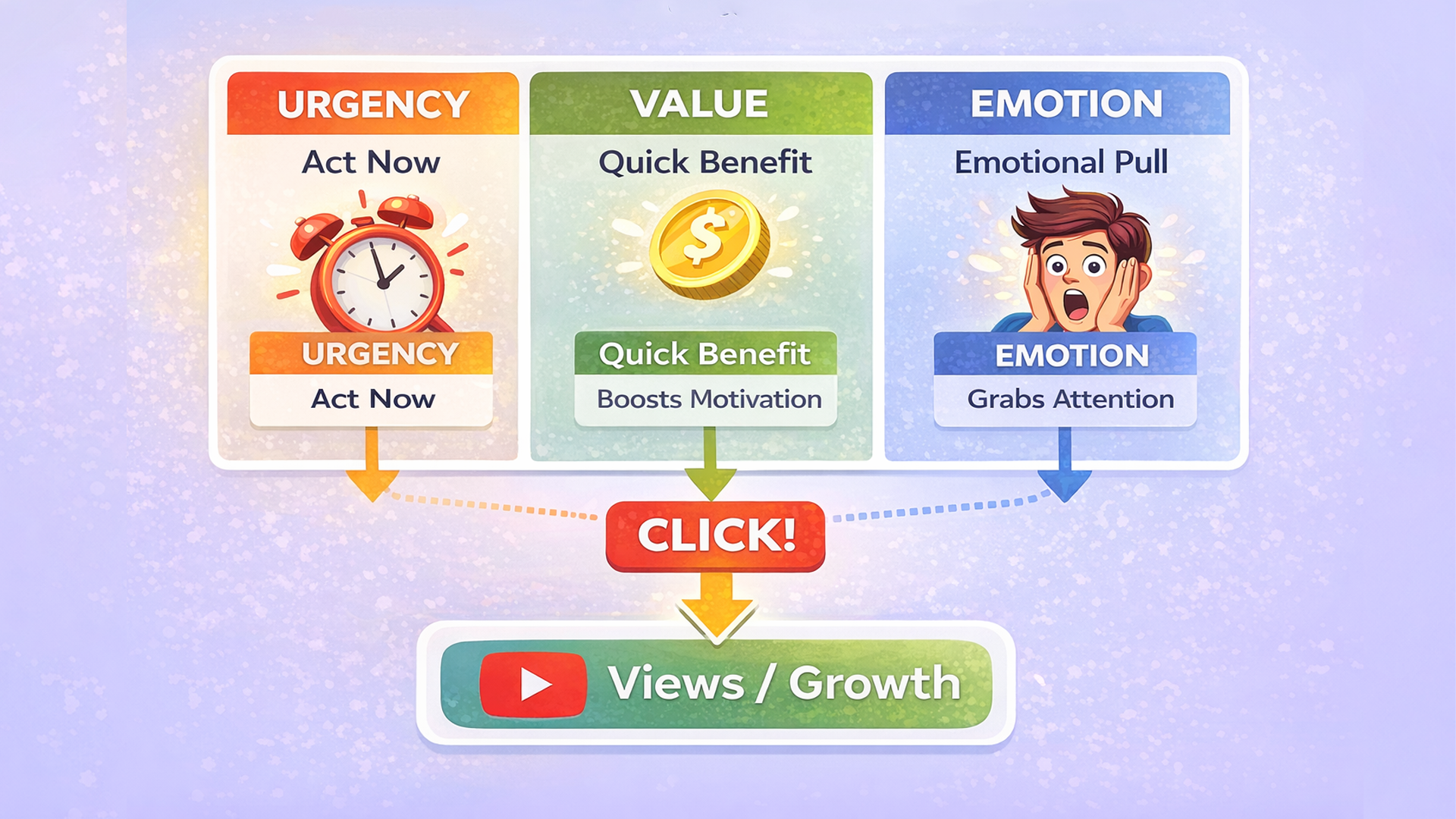
These triggers don’t need to be misleading. They just need to be honest and specific.
The key is clarity. People don’t want to guess what your video is about. If your thumbnail feels confusing or vague, they’ll skip it—no matter how strong the content is.
Psychologically, urgency works best when it feels relevant. The viewer must feel, “This matters to me right now.” Emotional triggers amplify that feeling, but only when grounded in reality.
Good thumbnails don’t scream. They signal value clearly and confidently.