Table of Contents
In a world where countless videos are uploaded daily, standing out can be a real challenge. One surefire way to capture attention is by designing click-worthy thumbnails that entice viewers to stop scrolling and start watching. But how exactly do you create a thumbnail that not only grabs attention but also drives clicks? In this guide, we’ll explore how to design effective, engaging thumbnails for your videos and highlight why thumbnails are crucial for video success.
Why Thumbnails Matter: The First Impression Counts
Your thumbnail is often the very first thing potential viewers see when scrolling through platforms like YouTube. It acts as a preview or snapshot of your video content, and in many cases, it’s the make-or-break factor in whether someone clicks to watch or keeps scrolling.
According to YouTube, 90% of the most popular videos feature custom thumbnails, which shows just how critical they are. A well-designed thumbnail gives your video an edge and can significantly boost your Click-Through Rate (CTR).
Design Click-Worthy Thumbnails: The Best Practices
Now that you know why thumbnails are so important, let’s jump into how to design them. The following tips will help you create thumbnails that engage, attract, and, most importantly, get clicksKeep It Relevant and Honest
Your thumbnail needs to accurately reflect what your video is about. Misleading thumbnails that don’t align with your content may get initial clicks, but they will also lead to disappointed viewers, resulting in low watch time or even dislikes.It’s crucial to only give previews of the content in your thumbnail—don’t deceive the viewer by introducing elements that aren’t in the video.
Image: TedEd
Use Faces to Capture EmotionIf you want to grab people’s attention quickly, use human faces in your thumbnails. Studies show that humans are naturally drawn to faces, especially those that express emotion. When creating click-worthy thumbnails, focus on conveying an emotion or reaction that resonates with the viewer.Whether it’s excitement, surprise, or curiosity, the emotion in a person’s face can create an immediate connection with potential viewers.
Image: Doctor Mike
Stick to a Consistent Design Pattern
One of the best things you can do to make your videos more recognizable is by sticking to a consistent design pattern across your thumbnails. This means using similar colors, fonts, and keyword placement to build a cohesive look.Consistency also helps in building a personal or brand identity. When viewers recognize your thumbnails instantly, they’re more likely to click on your content because they already know what to expect.
Image: Nat Geo
Key Elements of a Click-Worthy Thumbnail
Let’s break down some of the most important elements you should incorporate into your thumbnail designs:Bold, Readable Text
When adding text to your thumbnails, make sure it’s bold and easy to read. Avoid overcrowding the image with too much text. Ideally, keep text concise and ensure it doesn’t cover more than 50% of your thumbnail space. Also, use contrasting colors for the text to make it stand out against the background.
High-Quality Images
Never compromise on image quality. Your thumbnail should be crisp, clear, and professionally designed. A blurry or pixelated thumbnail will turn viewers off immediately. Opt for high-resolution images to maintain a professional and polished appearance.
Contrasting Colors
Using bright, contrasting colors can make your thumbnail pop. Colors that contrast well with each other naturally catch the eye, making your video more likely to stand out in a sea of other content. However, be mindful of the colors you choose; they should align with your video’s theme and your brand’s identity.Tips for Optimizing Thumbnails for YouTube and Other Platforms
Since YouTube is the biggest platform for video content, most of these tips will be applicable for YouTube thumbnails specifically, but you can also use them for other platforms like Facebook, Instagram, or even your explainer video company’s website.Create Custom Thumbnails
Custom thumbnails consistently outperform auto-generated ones. When you create a custom explainer video or 2D animated explainer video, don’t just settle for the default thumbnail that platforms like YouTube choose for you. Custom designs show effort and entice viewers with specific, well-thought-out visuals.Add Text That Complements Your Title
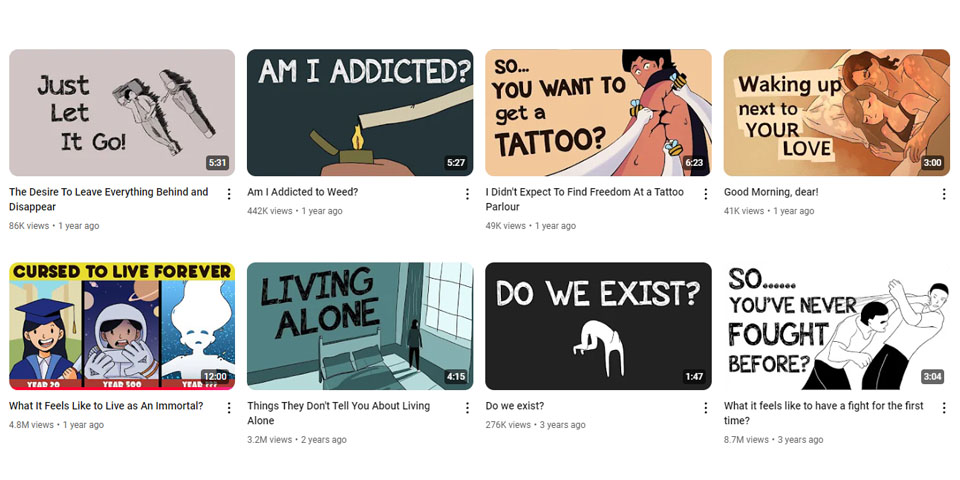
Text on your thumbnail should enhance the video title, not duplicate it. If your video title is long, pick a keyword or short phrase that sums up the video’s theme or takeaway. This can significantly increase engagement since viewers will understand the value proposition of the video from a glance.
Image: LazyOwl
Highlight Key Stats or Benefits
Sometimes, especially for videos in the B2B or SaaS space, you may want to incorporate specific statistics or numbers into your thumbnails. Numbers work because they quickly convey value and create curiosity. For example, in an infographic explainer video, you could include a key stat that hooks the viewer and gets them interested in learning more.Mistakes to Avoid When Designing Thumbnails
While designing click-worthy thumbnails can be fun, there are common mistakes that you should avoid:Overcrowding the Thumbnail
Too many elements—like excessive text, multiple images, or too much visual clutter—can make your thumbnail confusing. Keep it simple and focused. A cluttered thumbnail will overwhelm the viewer and deter them from clicking.
Using Misleading Thumbnails
Never use misleading visuals that promise something your video doesn’t deliver. For example, don’t feature a celebrity or trending event in your thumbnail if your video barely mentions them. This can damage your credibility and turn off viewers for good.
Ignoring the Mobile Experience
Remember that a large portion of your audience will be viewing your thumbnails on mobile devices, so make sure your thumbnails are optimized for smaller screens. Text should be readable, and images should be clear even when scaled down.Final Thoughts: Design Thumbnails That Drive Clicks
The key takeaway here is that well-designed, custom thumbnails can make a huge difference in your video’s performance. Whether you’re a YouTuber, a business creating B2B explainer videos, or simply a content creator trying to grow your audience, knowing how to design click-worthy thumbnails is essential to driving more views and engagement.
Remember, your thumbnail is the face of your video. So, put the effort into making it eye-catching, relevant, and clear. Stick to the best practices, avoid common pitfalls, and soon you’ll see a boost in both clicks and audience retention!
By mastering the art of thumbnail creation, you’re not just improving your video content—you’re crafting a visual gateway that compels viewers to click, watch, and engage. Keep experimenting with different designs, analyze your results, and refine your approach to keep those clicks coming!
Unlock the power of captivating visuals with our seasoned expertise! With 7 years of crafting compelling visual content, we’re ready to elevate your brand’s story. From stunning graphics to mesmerizing animations, we bring your vision to life. Let’s create engaging visuals that resonate with your audience and leave a lasting impression. Partner with us today for an unforgettable visual journey!
