corporate presentation mistakes

Table of Contents

Corporate presentations are everywhere. Boardrooms, Zoom calls, investor meetings, sales pitches, internal reviews — slides have become the default language of business. In theory, presentations should clarify complex ideas, align teams, inspire confidence, and influence decisions. In practice, many of them do the opposite. They overwhelm audiences, dilute key messages, and quietly damage credibility.

If you’ve ever sat through a meeting where slides were filled with dense paragraphs, mismatched fonts, cluttered charts, and endless bullet points, you’ve witnessed the issue firsthand. These aren’t random design flaws. They are recurring corporate presentation mistakes that businesses repeat again and again — often without realizing the long-term impact.

The problem isn’t the software. It’s not PowerPoint, Keynote, or any other tool. The deeper issue lies in how presentations are structured, designed, and delivered. Slides are treated like documents instead of communication tools. Information is dumped instead of curated. Visual hierarchy is ignored. Storytelling is absent. The result? A presentation that feels visually broken and strategically weak.

In this guide, we’ll unpack why most corporate presentations fail visually and strategically — and more importantly, how to fix them in a way that makes you look polished, persuasive, and professional.

The Real Purpose of Presentations (Why Corporate Presentation Mistakes Hurt More)

Presentations are not just slide decks. They are strategic communication tools that shape how people perceive your thinking, your competence, and your leadership. Every time you step into a meeting room or log into a virtual call and share your screen, you are doing far more than presenting information. You are influencing how others interpret your clarity, your preparation, and your authority.

In corporate environments, perception often moves faster than logic. Before anyone deeply analyzes your data, they subconsciously evaluate structure, visual discipline, and confidence. This is why recurring corporate presentation mistakes carry more weight than most professionals realize. They don’t just make slides look messy — they quietly weaken credibility.

Presentations Shape Perception Before They Shape Decisions

A strong presentation does several things at once. It demonstrates that you understand your subject deeply. It shows that you can distill complexity into clarity. It signals that you respect your audience’s time and attention. When structure is tight and visuals are clean, audiences assume the underlying thinking is equally structured.

On the other hand, when slides are cluttered, inconsistent, or poorly organized, doubt creeps in. Decision-makers may not consciously articulate the problem, but they feel friction. Visual chaos suggests strategic chaos. Disorganized flow suggests unclear priorities.

This is how corporate presentation mistakes silently influence judgment.

The Leadership Signal Hidden Inside Every Slide

Leadership is often evaluated through communication. Executives, clients, and stakeholders interpret presentation quality as a proxy for strategic discipline. A well-crafted presentation:

  • Demonstrates expertise through clarity
  • Builds credibility through structure
  • Clarifies thinking through logical flow
  • Aligns stakeholders around shared understanding
  • Encourages action through persuasive sequencing

A weak presentation does the opposite. It creates confusion. It drains energy. It forces audiences to work harder than they should.

In high-stakes environments — such as investor pitches, enterprise sales meetings, or board-level reviews — this difference becomes critical. A clear and confident presentation can secure approval or funding. A visually broken one can introduce hesitation, even if the idea itself is strong.

Why Visual Clarity Equals Strategic Clarity

Decision-makers often equate visual organization with intellectual organization. If your slides are clean, focused, and purposeful, your strategy feels the same. If your slides are chaotic, your thinking appears chaotic.

This is why corporate presentation mistakes are more than aesthetic flaws. They are leadership signals.

The takeaway is simple but powerful: presentations are reflections of authority. When they look broken, your credibility looks fragile. When they look intentional and structured, your leadership feels intentional and structured too.

Fixing corporate presentation mistakes isn’t about impressing people with design. It’s about protecting and strengthening your professional image every time you present.

Information Overload: The Most Common Corporate Presentation Mistake

Among all recurring corporate presentation mistakes, information overload is by far the most common — and the most damaging. Many professionals believe that including more data strengthens their credibility. The logic feels sound: if you show everything, no one can question your preparation. In reality, the opposite happens. When slides become overloaded, clarity collapses.

Information overload doesn’t just make slides look busy. It makes them cognitively exhausting. And when an audience becomes mentally tired, persuasion stops.

Why Overcrowded Slides Fail (The Cognitive Reality)

When a slide contains dense paragraphs, detailed charts, and multiple bullet lists, the audience is forced into a split-attention dilemma. They must choose between reading and listening. Cognitive science consistently shows that humans cannot effectively process heavy visual text while simultaneously absorbing spoken explanation.

Consider a typical performance update slide:

  • A paragraph explaining shifting market conditions
  • Two complex graphs with legends and trend lines
  • Six bullet points summarizing operational initiatives


On paper, this looks comprehensive. In practice, it overwhelms.

The audience scans the paragraph. They glance at the graphs. They attempt to follow your explanation. Within seconds, attention fragments. Instead of reinforcing your message, the slide competes with you.

This is one of the most destructive corporate presentation mistakes because it weakens comprehension at the neurological level. The brain has limited working memory. When overloaded, retention drops dramatically.

The Fear Behind Information Overload

Overcrowding usually stems from insecurity rather than strategy. Presenters fear that leaving something out will make them appear unprepared. They worry that if a question arises, they won’t have visual proof ready. So they compensate by adding everything.

But here’s the truth: clarity signals confidence. Over-explaining signals uncertainty.

Experienced leaders rarely overload slides. They distill. They simplify. They highlight what matters.

When you attempt to show everything, you unintentionally signal that you cannot prioritize.

How to Fix Information Overload Strategically

Fixing this corporate presentation mistake requires discipline.

First, adopt the one-message-per-slide rule. Each slide should communicate a single core idea. If you find yourself explaining multiple unrelated concepts on one slide, split them.

Second, distinguish between primary and secondary information. Primary insights belong on main slides. Supporting data belongs in appendix slides. This allows you to maintain clarity while staying prepared for deeper discussion.

Third, use visuals intentionally. Charts should highlight a single insight rather than display every available metric. Instead of showing five lines on a graph, emphasize the one that supports your argument.

When you remove clutter, something powerful happens: your authority increases. The audience feels guided instead of overwhelmed. They can focus on your narrative instead of decoding your slide.

Information overload is not a sign of expertise. It is one of the most common corporate presentation mistakes that makes professionals look scattered. Simplicity, when done intentionally, is a signal of mastery.

Visual Inconsistency: A Silent Professional Killer

Another major contributor to recurring corporate presentation mistakes is inconsistent visual design. Unlike information overload, which feels obvious, visual inconsistency is subtle. It creeps in quietly — through mismatched fonts, clashing color palettes, uneven spacing, and poorly aligned elements. Individually, these flaws may seem minor. Collectively, they create visual noise.

And visual noise damages credibility.

Design is processed instantly. Before anyone reads your content, they’ve already formed an impression based on structure and aesthetics. When slides feel disjointed or chaotic, the audience subconsciously associates that chaos with your thinking. This is why visual corporate presentation mistakes are so dangerous — they shape perception before logic even begins.

The Three-Font Golden Rule

Professional presentations follow a simple discipline: limit typography. Rarely should you use more than two or three typeface families:

One for headlines

One for body text

Optional one for emphasis or highlights

When slides use five different fonts — some bold, some italic, some decorative — the result feels amateurish. Typography inconsistency makes the presentation look like it was assembled without intention.

Fonts communicate tone. A clean sans-serif font signals modern clarity. A serif font suggests tradition. Mixing styles without purpose creates confusion.

Strong presentations are visually calm. Typography consistency creates rhythm and flow, allowing the audience to focus on content rather than formatting.

Why Consistency Builds Trust

Design consistency signals discipline. When margins, spacing, alignment, and color usage remain uniform throughout the deck, your presentation feels cohesive and professional.

Consistency reduces cognitive friction. The audience doesn’t have to reorient themselves with every new slide. Their attention stays on your message.

Simple adjustments dramatically reduce visual corporate presentation mistakes:

  • Align text and visuals using a grid system
  • Maintain consistent margins across slides
  • Stick to defined brand colors
  • Use whitespace intentionally to create breathing room
  • Whitespace is not empty space — it is structure. It guides the eye and emphasizes importance.

Design Is Communication Architecture

Many professionals treat design as decoration. It isn’t. Design is communication architecture. It determines how information flows and what stands out.

When layout is intentional, key messages become clearer. When hierarchy is strong, audiences instinctively know where to look. When color is used sparingly and purposefully, emphasis feels deliberate rather than chaotic.

Fixing visual corporate presentation mistakes doesn’t require becoming a graphic designer. It requires adopting a system. A consistent template. A limited color palette. Clear alignment rules.

Once those systems are in place, your presentation stops looking improvised and starts looking authoritative.

And authority, visually reinforced, builds trust before you even speak.

Lack of Clear Objectives Behind Corporate Presentation Mistakes

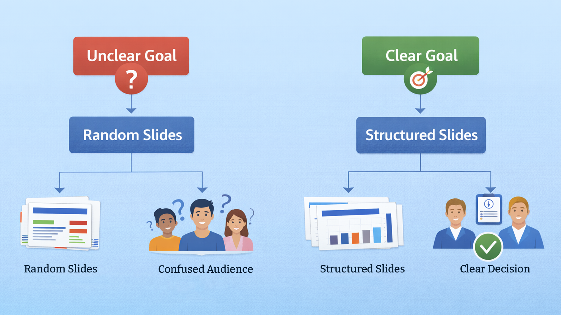
Many corporate presentation mistakes begin long before a single slide is designed. They start at the planning stage. When a presentation lacks a clearly defined objective, it becomes informational instead of persuasive. Slides accumulate content without direction. Messages drift. Audiences leave unsure about what was actually decided or why it mattered.

Clarity of purpose is the backbone of structure. Without it, even beautifully designed slides cannot save the presentation.

Why “Just Sharing Updates” Isn’t a Strategic Goal

One of the most common phrases used before building a presentation is, “I just need to share some updates.” That mindset is where problems begin.

An update is not an outcome. A strong presentation should aim to create change. It should influence a decision, secure approval, align a team, or drive action. When the objective is vague, structure weakens immediately.

For example, if you’re presenting a new initiative to leadership but your slides focus mainly on background information rather than demonstrating measurable impact, the conversation stalls. The audience may understand what happened, but they don’t know what they’re expected to do next.

This is one of the most damaging corporate presentation mistakes because it affects every slide that follows. When objectives are unclear, slides feel disconnected. Transitions feel abrupt. The presentation feels like a collection of information rather than a structured argument.

Using SMART Thinking to Strengthen Structure

Before opening slide software, ask yourself three critical questions:

  • What decision do I want made?
  • What action should follow this meeting?
  • What belief or perception should change?

Applying SMART principles — specific, measurable, achievable, relevant, and time-bound — sharpens clarity. Once the goal is precise, irrelevant content becomes easier to remove.
Clear objectives act as a filter. They eliminate noise. They prevent rambling. They reduce unnecessary slides.

When structure is driven by purpose, corporate presentation mistakes decrease dramatically because every element aligns with a defined outcome.

Storytelling: The Missing Link in Most Corporate Presentations

Another deeply rooted corporate presentation mistake is the absence of storytelling. Many presentations present information chronologically, categorically, or departmentally instead of narratively. While this approach may feel organized internally, it rarely engages an audience emotionally or cognitively.

Data alone informs. Stories persuade.

Humans are wired to understand information in narrative form. When ideas follow a journey — with tension, challenge, and resolution — they become more memorable and impactful.

Turning Data into Narrative

Consider a quarterly revenue presentation.

Most decks list numbers slide after slide. Growth percentages. Market breakdowns. Operational metrics. Technically correct, yet emotionally flat.

Now imagine restructuring the same data:

  • Begin with the challenge faced at the start of the quarter.
  • Explain the strategic shift your team implemented.
  • Highlight measurable results achieved because of that shift.


The numbers remain identical. The difference lies in sequencing.

Instead of presenting static data, you’re telling a story of problem-solving and progress. That narrative creates engagement and meaning.

This shift alone eliminates many corporate presentation mistakes related to monotony and disengagement.

A Simple Story Framework for Business Presentations

To build stronger narrative flow, follow this structure:

  • Define the problem.
  • Describe the obstacles or constraints.
  • Introduce the strategy or solution.
  • Demonstrate measurable outcomes.


This framework forces logical progression. It ensures that every slide moves the audience forward rather than sideways.

Story-driven presentations create emotional connection, improve retention, and naturally guide audiences toward the desired action.

Without storytelling, presentations often feel mechanical. With storytelling, they feel intentional.

Audience Misalignment and Engagement Gaps

One of the most overlooked corporate presentation mistakes is failing to design with the audience in mind. Many presenters build slides around what they want to say instead of what the audience needs to hear. That subtle shift in perspective changes everything.

A presentation should never revolve around the presenter’s comfort zone. It should revolve around the audience’s priorities, concerns, knowledge level, and expectations. When that alignment is missing, friction appears — and friction quietly reduces persuasion.

Technical vs Executive Perspective

Consider the difference between presenting to a technical team versus presenting to senior executives.

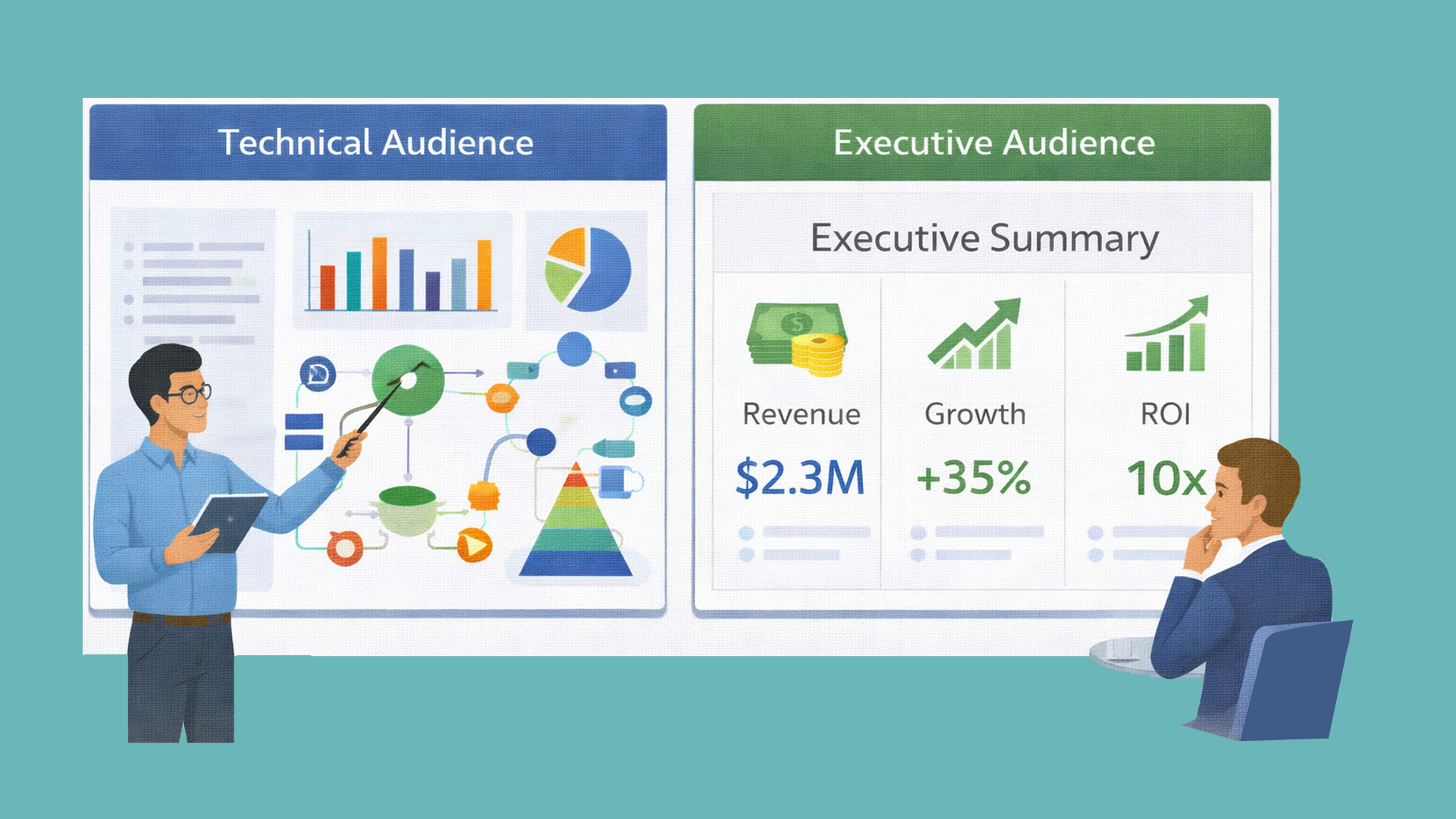
A technical audience may appreciate deep dives into system architecture, process flows, implementation details, and engineering trade-offs. They want to understand how something works. Executives, on the other hand, care more about strategic impact — revenue growth, cost efficiency, scalability, risk exposure, and competitive positioning.

If you present technical diagrams in a boardroom discussion about market expansion, engagement drops immediately. Conversely, if you oversimplify critical details in a specialist review session, credibility suffers.

This mismatch is one of the most subtle corporate presentation mistakes. The content itself may be correct, but it is delivered at the wrong level of depth.

Misalignment creates friction. And friction weakens trust.

Designing for Engagement Instead of Assumption

Before building slides, ask yourself:

  • What does this audience care about most?
  • What objections might they raise?
  • What level of depth is appropriate?
  • What outcome matters personally to them?

These questions force you to shift from presenter-centered thinking to audience-centered strategy.

When presentations reflect audience priorities, engagement increases naturally. Relevance builds trust. People listen more carefully when they feel understood. And when they feel understood, they are more open to influence.

Audience-centered thinking dramatically reduces corporate presentation mistakes by aligning tone, structure, and messaging with expectations.

Public Speaking Errors That Amplify Corporate Presentation Mistakes

Even the most visually polished slides can collapse under weak delivery. Corporate presentation mistakes are not only visual — they are behavioral. How you speak, move, and engage the room determines how your message lands.

Common delivery issues include speaking too fast, reading directly from slides, overusing jargon, avoiding eye contact, and relying heavily on notes. These behaviors reduce authority instantly.

Why Delivery Shapes Authority More Than Slides

Your voice and body language communicate confidence long before your audience analyzes your content. Strong posture signals leadership. Steady pacing signals control. Natural gestures signal comfort. Eye contact builds trust.

When you rush through slides, audiences struggle to absorb information. When you read verbatim from the screen, you appear unprepared. When you rely on jargon without explanation, you create distance.

Delivery flaws amplify existing corporate presentation mistakes. If slides are slightly cluttered but delivery is strong, impact can still survive. If slides are strong but delivery is weak, impact collapses.

The Power of Rehearsal and Presence

Rehearsing aloud improves flow, transitions, and timing. It helps identify awkward phrasing and unnecessary repetition. Internalizing your content allows you to speak conversationally rather than mechanically.

Enthusiasm also plays a crucial role. If you appear disengaged, your audience will mirror that energy. Passion is persuasive. Confidence is contagious.
Strong delivery transforms good slides into powerful presentations.

Technical and Execution Failures That Undermine Professionalism

Sometimes corporate presentation mistakes occur not in planning or design but in execution. Technical disruptions can instantly damage credibility, regardless of how strong your content is.

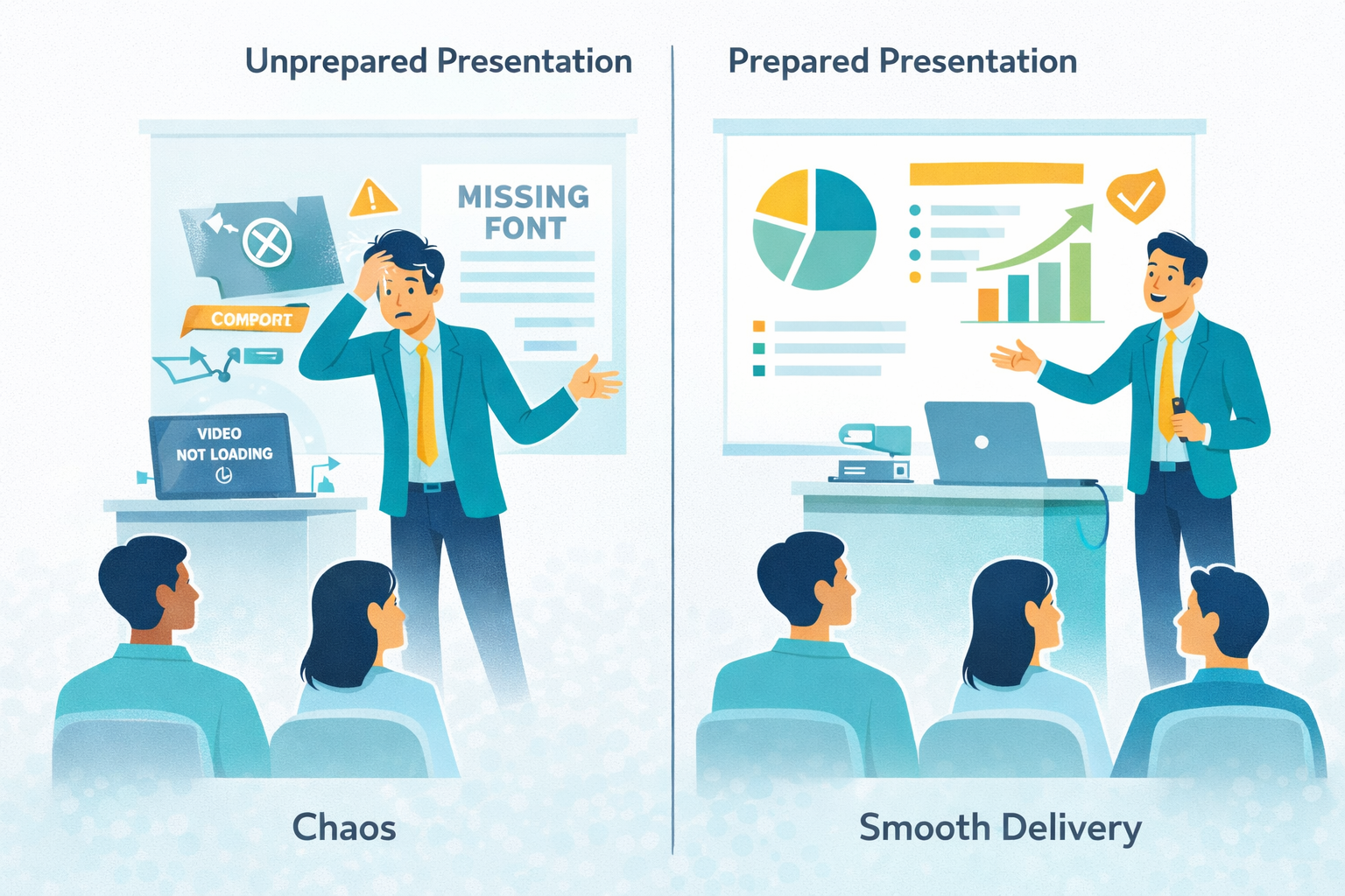
Common technical breakdowns include:

  • Videos failing to load
  • Broken hyperlinks
  • Formatting inconsistencies across devices
  • Audio or screen-sharing issues
  • Missing fonts that alter layout

These issues may seem minor, but they disrupt flow and shift attention away from your message.

Preparation Is Professionalism

Execution discipline reflects preparation. Always test your presentation on the actual device and platform you will use. Check that videos load properly. Ensure fonts display correctly. Keep backup files stored locally. Prepare offline versions of internet-dependent content.

When technical elements function smoothly, your authority remains intact. When they fail, you appear reactive instead of prepared.

Preventing execution-related corporate presentation mistakes requires planning, not improvisation.

When Slides Aren’t Enough: Embracing Visual Alternatives

In some contexts, fixing corporate presentation mistakes requires rethinking the format itself. Static slides remain essential in many corporate settings, but modern audiences often engage more deeply with dynamic visual storytelling.

  • Businesses increasingly supplement traditional presentations with:
  • Custom explainer video solutions
  • B2B explainer video formats for complex services
  • Infographics explainer video presentations
  • SaaS explainer video content for product education


For example, a SaaS company launching a new platform may struggle to explain features using dense slides. A short SaaS explainer video can visually demonstrate workflows and benefits in minutes. Similarly, enterprise firms often work with an experienced explainer video company to transform technical content into engaging narratives for sales or onboarding.

This shift does not eliminate presentations. Instead, it expands communication strategy. Choosing the right medium for the right objective prevents format-related corporate presentation mistakes.

Slides work well for structured decision-making discussions. Visual storytelling formats work well for product education and marketing.

Smart communicators know when to use both.

Building a Long-Term Framework to Eliminate Corporate Presentation Mistakes

Eliminating recurring corporate presentation mistakes requires systemic improvement rather than occasional fixes. Organizations that treat presentation quality as a strategic priority outperform those that treat it as a last-minute task.

A strong internal framework typically includes:

  • Standardized presentation templates aligned with brand identity
  • Defined typography and color systems
  • Clear visual hierarchy guidelines
  • Storytelling and narrative structure training
  • Audience analysis checklists
  • Rehearsal protocols before high-stakes meetings

When presentation standards become institutionalized rather than improvised, quality improves across departments.

Consistency creates professionalism. Structure creates clarity. Discipline creates authority.Corporate presentation mistakes are rarely about lack of intelligence. They are about lack of system.

When a framework is in place, presentations stop being reactive slide compilations and become intentional communication tools.

From Visually Broken to Visually Persuasive

Most presentations are not broken because of software. They are broken because of preventable corporate presentation mistakes in structure, design, storytelling, and delivery.

When you define clear objectives, simplify slides, maintain consistency, tailor content to your audience, and refine delivery, your presentations become powerful assets.

Professionalism is not about adding more slides. It’s about removing friction.
Eliminate corporate presentation mistakes, and you won’t just look better — you’ll think clearer, persuade stronger, and lead more effectively.

Unlock the power of captivating visuals with our seasoned expertise! With 7 years of crafting compelling visual content, we’re ready to elevate your brand’s story. From stunning graphics to mesmerizing animations, we bring your vision to life. Let’s create engaging visuals that resonate with your audience and leave a lasting impression. Partner with us today for an unforgettable visual journey! 

Check out our work.