Animated Infographics

Table of Contents

In a world overflowing with data, facts, and figures, getting your audience to actually understand what you’re saying is harder than ever. Especially if you’re a startup or a growing business, you’re constantly juggling two massive challenges: explaining something complicated… and holding people’s attention long enough to care.

That’s where simplifying complex data with animated infographics steps in — and trust me, it’s a game-changer.

Let’s walk through why turning dense data into engaging visuals is the move, and how you can start using animated infographics to transform your communication strategy.

Why Simplifying Complex Data Matters More Than Ever

Here’s the brutal truth: It doesn’t matter how brilliant your product is or how many features it’s packed with — if your audience doesn’t get it within a few seconds, they’re gone.

We live in a scroll-fast, click-faster world where attention spans are shorter than ever. And when people are bombarded with dashboards, jargon, and data overload, you only get one chance to make your message stick.

That’s exactly why simplifying complex data isn’t a “nice-to-have” — it’s a must-do.

Why Clarity Wins in Today’s World

Let’s break it down. When you simplify complex data using animation or visual storytelling, you’re doing a few powerful things at once:


Breaking Down Technical Info into Digestible Bits
Instead of throwing your audience into the deep end with a wall of text or a messy spreadsheet, you guide them through bite-sized, understandable chunks. It’s the difference between saying “here’s everything, good luck” and “let me walk you through this.”

Presenting Your Core Message Faster
Your audience doesn’t have all day — and you shouldn’t expect them to. Simplified, animated visuals help you distill your main value prop in seconds. No fluff. No confusion. Just clarity.

Appealing to Both Analytical and Visual Thinkers
Some people love data. Others love stories. But when you combine data visualization with engaging visuals, you appeal to both sides of the brain. You give logic and emotion a seat at the same table — and that’s when the magic happens.

Improving Retention and Engagement
Here’s the stat that blows most marketers’ minds:

Viewers retain 95% of a message when they watch it in a video, compared to just 10% when reading it in text.
That’s not a small difference — it’s a game-changing one.

Think about it. If you’re investing time and money into creating content or crafting a pitch, wouldn’t you want people to actually remember it?

Why It Matters Even More for Startups and B2B Brands

If you’re a startup, SaaS product, or in B2B — chances are, your product isn’t super easy to explain in one sentence. Maybe you’re dealing with tech-heavy workflows, abstract value, or data-driven benefits that aren’t immediately obvious.

Here’s the catch: people won’t do the mental heavy lifting for you.

Simplifying complex data through animated infographics helps you:

  • Communicate your value in a few powerful visuals
  • Build trust faster
  • Stand out from competitors drowning in technical lingo
  • Create content that’s sharable, watchable, and memorable


In short — it helps your audience understand why you matter, and that’s everything.

Animated Infographics: What Are They Really?

Think of animated infographics as the love child between a beautifully designed infographic and a short, snappy explainer video. They combine data visualization, motion graphics, and storytelling into one compelling format that educates, entertains, and converts.

They’re not just charts with some bounce; they’re designed to guide the viewer, highlight key points, and communicate complex messages in a way that’s impossible to ignore.

Whether it’s a SaaS explainer video breaking down platform workflows or a B2B explainer video pitching a new enterprise tool, animation gives your message wings.

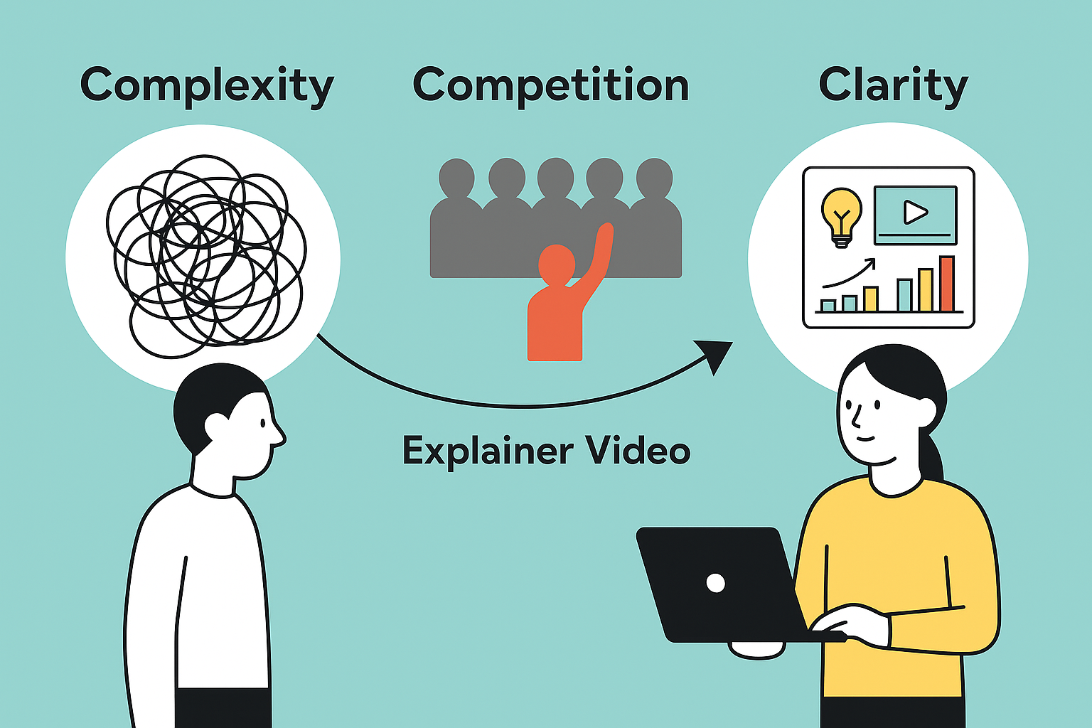
The Startup Struggle: Complexity, Competition, and Clarity

Starting a business is thrilling, but let’s be honest — it’s messy. One of the first big hurdles? Explaining what you do in a way that’s clear, engaging, and memorable.


You’re trying to:

  • Make a killer first impression.
  • Differentiate from the competition.
  • Explain your unique value without boring people to death.


Meanwhile, your competitors are also out there shouting for attention. In this noise, clarity is your competitive edge.

That’s why every startup should seriously consider investing in a custom explainer video — especially one that uses animated infographics to simplify complex concepts.

Explainer Videos: Your Visual Superpower

Explainer videos are like your 24/7 sales rep. Always ready. Always clear. Always on-message.

These short, engaging videos focus on solving a problem, walking viewers through a solution, and showcasing the value you offer — in about 60 to 90 seconds.

Now imagine your explainer video packed with animated infographics that visualize:

  • Workflow steps
  • User benefits
  • Product data
  • Case study results
  • Or even customer testimonials

That’s not just a pitch — that’s persuasion on autopilot.

Simplifying Complex Data with Animated Infographics: Here’s How

You might be thinking: “Cool concept, but how exactly do animated infographics help simplify data?”

Here’s the breakdown:

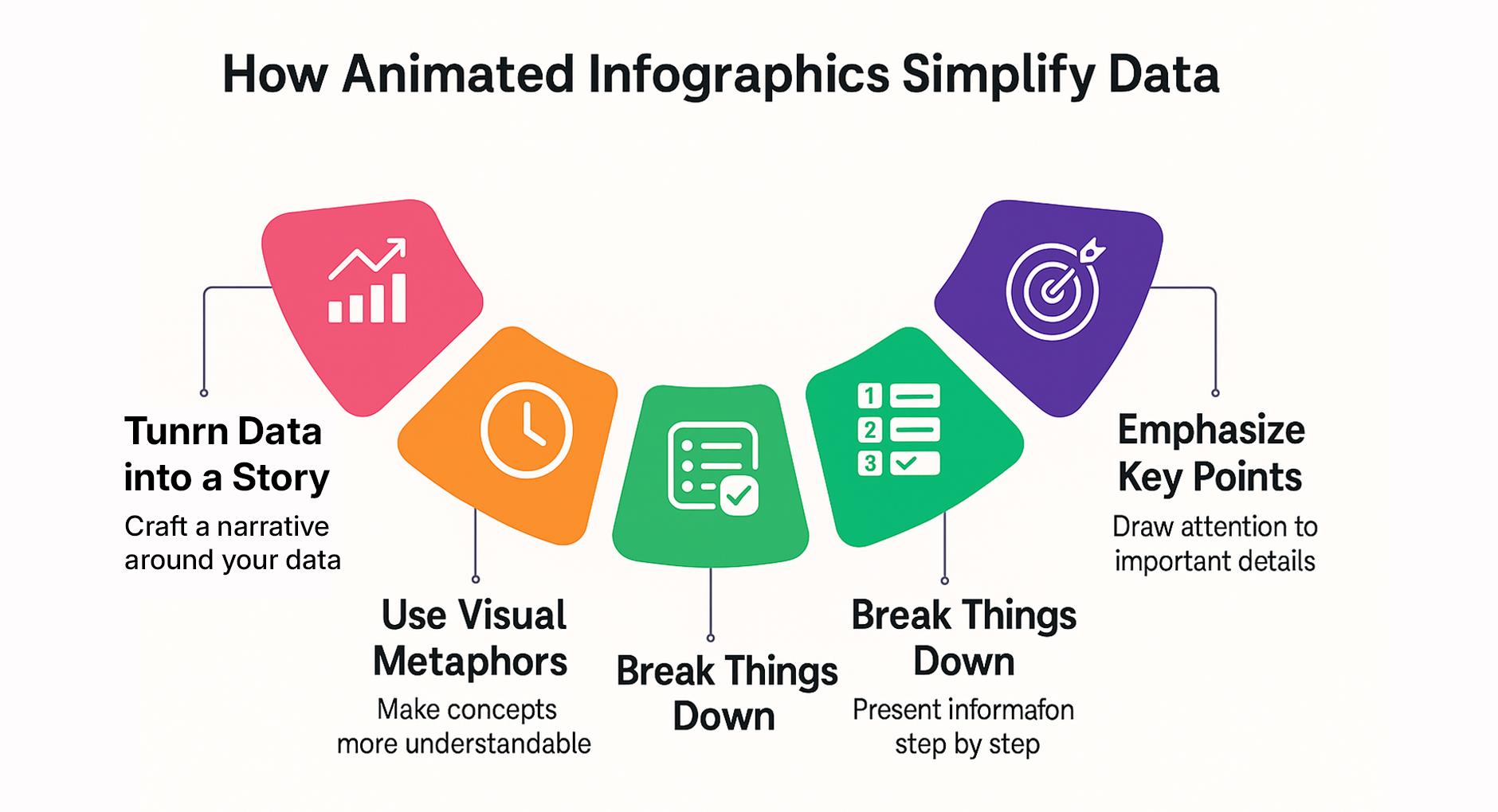
1. Turn Raw Data into a Story
A spreadsheet is just… numbers. But animation brings those numbers to life. You can guide the viewer from problem to solution using a narrative arc — even with boring data.
Whether you’re trying to show market potential, user growth, or technical results, animated infographics build a compelling narrative around the numbers.

2.Use Visual Metaphors to Drive the Point Home
Want to explain cloud storage to non-tech users? Try showing a physical filing cabinet moving into the sky. That’s the beauty of 2D animated explainer videos — you can use metaphors to make the abstract feel familiar.
Visual metaphors simplify learning, making it easier for audiences to connect the dots instantly.

3.Break It Down Step by Step
Complex processes often lose people because they throw everything at them at once. Animation lets you drip-feed information in a sequence. Think:

  • Step 1 animation
  • Pause
  • Step 2
  • Emphasis on the result

Boom — clarity.

4.Emphasize What Matters
Animations guide the eye. With motion, color, and text hierarchy, you can direct attention exactly where it needs to be — no distractions, no confusion.

Highlight the important stuff and leave out the fluff. That’s how you respect your audience’s time.

Where Do You Use Animated Infographics? Everywhere.

Another perk? These videos aren’t just for your homepage. You can drop them into:

  • Landing pages to boost conversions
  • Email campaigns to improve CTR
  • Investor decks to impress with clarity
  • Social media posts to attract and engage
  • Product walkthroughs to improve onboarding


And let’s not forget pitch meetings. Investors love a clear pitch. An animated infographic can highlight your competitive edge, show growth metrics, and demonstrate market potential — all without you saying a word.

Why Animated Infographics Boost Conversion Rates

Let’s not ignore the real reason we’re here: growth.

Whether you’re an early-stage startup or a scaling business trying to break through the noise, your end goal is the same — to get people to act. That action could be signing up for a demo, subscribing to your newsletter, clicking “Buy Now,” or booking a call. And that’s where animated infographics shine.

Explainer Videos Simplify the Path to Action
When you use animated infographics to visually walk your audience through complex ideas, you’re not just making your content look pretty — you’re clearing the mental clutter. That clarity leads directly to action.

Here’s how:

Higher Landing Page Conversions
Let’s face it — most visitors bounce within seconds if they don’t immediately understand what you offer. A short, punchy explainer video with animated infographics can hook them instantly, walk them through the value, and nudge them toward a CTA without making them scroll forever.

Startups have reported conversion rate increases of 20% to 80% just by adding a relevant explainer video to their homepage. Why? Because videos explain faster and better than paragraphs ever will.

Increased Email Click-Through Rates
Emails with the word “video” in the subject line have a 13% higher open rate and can boost CTR by up to 300%. Now, imagine embedding a short infographic video inside your onboarding emails or newsletters. Instead of text fatigue, your audience gets an engaging visual breakdown — and a reason to keep clicking.

More Time Spent on Site
Google loves engagement. If users are bouncing off your site in seconds, that’s a red flag. But a well-placed animated explainer video keeps people around longer. They pause, they watch, they absorb. That signals relevance to search engines and improves your SEO rankings. Win-win.

Better Brand Recall
Animated infographics don’t just inform — they entertain and imprint. When you combine motion, narrative, and data visualization, you create an experience that’s sticky. Viewers are far more likely to remember your brand and what you do — which is crucial in crowded markets where being forgotten equals being invisible.

Improved Investor Understanding
Got a pitch deck? That’s great. Now add a short animated infographic that visually presents your growth trajectory, market size, and core differentiators. Investors appreciate clarity and brevity. A well-crafted video can give them a fast yet deep understanding of your business model — and that could be the difference between a polite pass and a term sheet.

Let’s Talk Numbers: Video = Conversions
According to marketing studies from sources like Wyzowl and HubSpot:

84% of people say they’ve been convinced to buy a product or service by watching a brand’s video.

74% of users who watched an explainer video about a product subsequently bought it.

And as mentioned earlier, landing pages with video can see an 80%+ uplift in conversion rates.

These aren’t soft metrics. They’re growth levers you can pull today.

How to Create an Animated Infographic That Works

If you’re thinking of DIY-ing this, slow down. Creating a high-performing infographic explainer video isn’t about slapping together stock icons and motion presets.

Here’s what you actually need:

1. A Clear Script
Your video’s success hinges on a crystal-clear, benefit-driven script. Start with the problem, introduce your solution, and end with a call to action. Simple.

2. Professional Voiceover
A human voice adds trust. Keep the tone conversational and confident. Avoid robotic narration unless it fits your brand style.

3. Strategic Design & Animation
Design isn’t just about looking pretty. It’s about guiding attention, emphasizing value, and keeping your audience engaged every second.

Work with a reliable explainer video company that knows how to balance aesthetics and strategy.

4. Customization Matters
Avoid templates. A custom explainer video built around your brand voice, tone, and unique offering will always perform better than something generic.

The best explainer video companies know this. They focus on personalized storytelling, not cookie-cutter content

When Should a Startup Invest in Explainer Videos?

Simple answer: As soon as you’re ready to explain what you do.

Even at MVP stage, if you have a clear offering, an explainer video can:

  • Validate your idea
  • Test your messaging
  • Build early investor confidence
  • Improve your landing page performance
  • Attract initial users

In short, explainer videos are not just “nice to have” — they’re a powerful business tool for early-stage growth.

Real-World Use Cases: Animated Infographics in Action

Let’s look at a few scenarios where simplifying complex data using animated visuals made all the difference.

Case 1: Open Data Blend

This Open Data Blend video highlights a common challenge faced by data professionals: spending 80% of their time on downloading and preparing open data, and only 20% on the actual analysis that delivers value. Through engaging infographics, the video explains how Open Data Blend flips this equation—radically speeding up data acquisition and preparation so analysts can focus on generating insights that matter.

The visuals make it easy to see how Open Data Blend streamlines complex processes, helping organizations quickly analyze trends from multiple perspectives without the usual time-consuming data prep. By showing clear before-and-after scenarios, the video demonstrates how teams can provide faster, more responsive services to both internal and external stakeholders.

With this infographics approach, the audience not only understands the product’s features but also the bigger picture: Open Data Blend empowers organizations to move from data wrangling to impactful analysis. The video reinforces the company’s role as a practical solution provider that turns the burden of open data into a competitive advantage.

Case 2: Agility Logistics

This Agility Logistics video focuses on smart packaging and its importance in the global supply chain. Agility, one of the world’s largest integrated logistics providers, uses this infographics video to simplify a topic that is often overlooked but critical to smooth international trade. Starting from its roots as a local warehousing provider in the Middle East, Agility has grown into a global logistics leader — and this video reflects that journey by educating audiences about smarter, more efficient packaging methods.

Through clear visuals and simple explanations, the video breaks down what could otherwise be a technical subject. It highlights how proper packaging not only protects goods but also reduces costs, minimizes damage, and ensures compliance with shipping standards. By turning complex logistics terms and processes into engaging visuals, Agility makes the concept approachable for first-generation entrepreneurs, small businesses, and anyone entering the world of import and export services.

This infographics video does more than teach packaging—it shows how Agility empowers businesses with knowledge. By explaining commercial rules and logistics practices in an accessible way, the video reinforces Agility’s role as not just a service provider, but an educator and partner helping global trade become simpler and smarter.

Case 3: Vox Documentary

By turning a dense, technical subject into a visually engaging story, the video makes polling more understandable and accessible for everyday viewers. Instead of leaving the audience overwhelmed by numbers, it empowers them to critically read polls, recognize their limitations, and grasp the bigger picture.

For Vox Documentary, this video perfectly demonstrates the company’s mission: simplifying complex issues through data-driven storytelling, clear visuals, and explanatory journalism. The use of infographics ensures that abstract concepts like “weighting” or “margin of error” aren’t just explained, but shown, making them far easier to digest. Ultimately, the video strengthens the audience’s trust in Vox as a source that doesn’t just report the news, but helps people understand it.

Case 4: Slack IT Admin Training

This Slack IT Admin Training video explores how modern work has become fragmented, inefficient, and overloaded with countless apps—and how Slack provides a powerful solution. The video explains that Slack is not just a messaging tool, but an AI-powered work operating system that brings people, apps, automation, and data together in one place. Through engaging infographics and clear visuals, it shows how teams can use Slack to collaborate faster, streamline workflows, integrate Salesforce data, leverage AI-powered search and summaries, and automate repetitive tasks with Workflow Builder.

By visualizing complex processes like AI search, Salesforce integration, and automation, the video makes it easy for IT admins and business leaders to understand how Slack transforms scattered information into actionable insights. Instead of getting lost in technical jargon, viewers see exactly how Slack’s features—like Agentforce, Sales Elevate, and generative AI—translate into real-world productivity gains.

This infographics video helps the audience grasp Slack’s role as a true work operating system rather than just another app. By simplifying the concept with visuals, it reinforces Slack’s value as a tool that saves time, reduces context switching, and empowers teams to work smarter. Ultimately, it strengthens understanding of the company’s mission: to make work less about “the work of work” and more about achieving results.

Conclusion: Use the Power of Animation to Be Understood

The days of long brochures and technical whitepapers are fading. In a fast-moving digital world, attention is scarce and clarity is priceless.

Simplifying complex data is not just about making it look pretty — it’s about making your value impossible to ignore.

Animated infographics are a cost-effective, high-impact way to:

  • Communicate clearly
  • Connect emotionally
  • Convert consistently


So if you’re a startup ready to take your pitch, product, or idea to the next level, it’s time to team up with an explainer video company that gets it — and bring your message to life through the magic of motion.

Unlock the power of captivating visuals with our seasoned expertise! With 7 years of crafting compelling visual content, we’re ready to elevate your brand’s story. From stunning graphics to mesmerizing animations, we bring your vision to life. Let’s create engaging visuals that resonate with your audience and leave a lasting impression. Partner with us today for an unforgettable visual journey! 

Check out our work.