Table of Contents

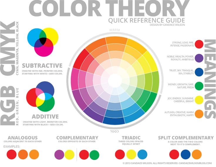
An explainer video is one of the best ways for a brand to market its offerings. Making the clip requires thought and detailing to attract customers in the best way. One thing that plays an integral role in explainer video marketing is brand colors.
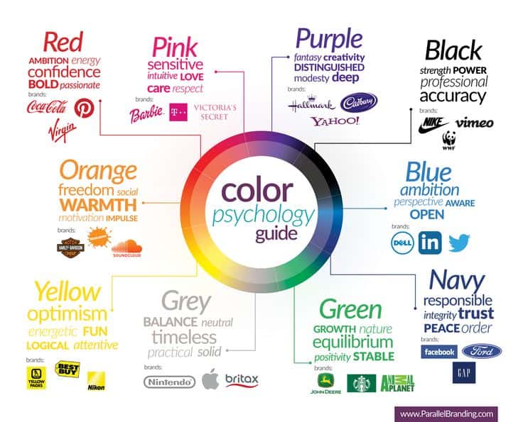
Have you ever wondered why the Facebook logo is blue and white? Or why Snapchat has yellow and white brand colors? Well, this is because the shades represent emotion. Each of them has a specific meaning that plays an integral role in marketing.
We tend to associate certain colors with particular things and emotions. For example, a pharmacy is expected to be white. Meanwhile, we expect a children’s school to be filled with different colors.
The association of colors to specific things is referred to as color psychology. It plays an integral role in explainer video marketing. Here is what you need to know about brand colors and their importance.

Role Of Colors In Explainer Video Marketing
Colors have different meanings associated with them, depending on the culture. For instance, white symbolizes grief in China, and yellow color is considered prestigious there. However, in Greece, yellow is associated with grief.
The colors have numerous meanings in different cultures and for other things. Here are the general purposes of various colors that are used in explainer video marketing in America and Europe:
Green
This color is associated with balance and harmony. Many brands use it to represent nature. For instance, an ad about herbal medicine will include this shade a lot. Green also symbolizes acceptance, love, and communication.
There are many shades of green, with each one having a different meaning. Therefore, its context plays an integral role in explainer video marketing. The color is also easily noticeable, which is why brands use it to grab attention effortlessly.
Blue
This color is widely used in explainer video marketing for inducing feelings of peace, calmness, emotional depth, and honesty. Blue is also associated with devotion and kindness.
Simply put, this color symbolizes different positive emotions. Typically, banks use this shade to induce a sense of security and responsibility. It allows the customer to feel that the bank is devoted to their cause and safety.
Purple
This is a rare color in nature but used in marketing for various purposes. Purple stimulates imagination and artistic qualities in different ways. It is a symbol of meditation and universal flow. Typically, females associate with it more than men.
The darker shade of purple is mainly used for marketing feminine products. For instance, many jewelry companies use this shade as their brand color. Cosmetic ads also include purple more than other colors.

Red
Red is a shade that stimulates passionate emotions and enhances the physical vibes of a person. It boosts vitality, stamina, and spontaneity. However, the color also offers a sense of stability to many people.
This color is considered contradictory to many people as it offers a sense of spontaneity and stability. A key feature of red is that it increases heart rate and makes you anxious. This is why it is used for subscribing button on websites and apps.
Yellow
Yellow is a light color that is associated with joy and fun feelings. It is used for symbolizing humor, intellect, creativity, logic, and much more. Many stores use it to seek the attention of window shoppers as the color piques curiosity.
However, keep in mind that yellow can be an eyesore to many people. This is why its shade matters a lot. Typically, neon would not be a good choice for explainer video marketing.
Orange
This shade is considered aggressive in the marketing world, but not in a bad way. It stimulates productivity and enthusiasm regarding work and other things. Typically, brands use it to induce customers to take a call of action.
Black
This is a universal color that can match various backgrounds and suits all gender. Black is mainly considered powerful, sleek, and exudes elegance. The color is primarily used for luxury product explainer video marketing.
Pink
This shade is mainly used to promote feminine products as it allows women to relate to this color. Typically, pink is used for inducing romantic emotions too.
Pink has been used in many sports locker rooms as well due to its calming effect. It is also used for breast cancer awareness because of the same reason.
How Colors Affect Explainer Video Marketing?
Here are the top things that colors help with in explainer video marketing:
Improving Landing Page
A landing page is an integral part of advertising as it attracts a customer to your brand’s website. Using the right colors will help you achieve traffic and turn visitors into paying customers. If your landing page is attractive, most of your marketing would be done already.
Helps Focus On Target Customers
Using colors while keeping your target audience in mind can help you gain more customers. For instance, if you sell products for women, it is good to use colors they associate with.
Typically, females prefer green, blue, and purple. Meanwhile, they are discouraged by gray, brown, and orange. Similarly, men associate with green and blue but disklike purple for being feminine.
Once you understand color psychology, you can use them suitably to attract your target audience. This will ensure that you are only getting the necessary traffic.
Creates A Vibe
Colors set a vibe for a product and can help you make more sales depending on that. Typically, using a mix of warm colors is preferred for explainer video marketing. The key thing to note is that different shades allow you to play with the feel of a client.
Final Words
This is everything you need to know about the importance of colors in explainer video marketing. Once you understand their meaning and vibes, you can use them easily for advertising. The top thing to remember is to create an appealing color combination for the target customers. When you do this, most of your work will be done.
In a world where countless videos are uploaded daily, standing out can be a real challenge. One surefire way to capture attention is by designing click-worthy thumbnails that entice viewers to stop scrolling and start watching. But how exactly do you create a thumbnail that not only grabs attention but also drives clicks? In this guide, we’ll explore how to design effective, engaging thumbnails for your videos and highlight why thumbnails are crucial for video success.
Why Thumbnails Matter: The First Impression Counts
Your thumbnail is often the very first thing potential viewers see when scrolling through platforms like YouTube. It acts as a preview or snapshot of your video content, and in many cases, it’s the make-or-break factor in whether someone clicks to watch or keeps scrolling.
According to YouTube, 90% of the most popular videos feature custom thumbnails, which shows just how critical they are. A well-designed thumbnail gives your video an edge and can significantly boost your Click-Through Rate (CTR).
Design Click-Worthy Thumbnails: The Best Practices
Now that you know why thumbnails are so important, let’s jump into how to design them. The following tips will help you create thumbnails that engage, attract, and, most importantly, get clicks
Keep It Relevant and Honest
Your thumbnail needs to accurately reflect what your video is about. Misleading thumbnails that don’t align with your content may get initial clicks, but they will also lead to disappointed viewers, resulting in low watch time or even dislikes.
It’s crucial to only give previews of the content in your thumbnail—don’t deceive the viewer by introducing elements that aren’t in the video. 
Image: TedEd
Use Faces to Capture Emotion
If you want to grab people’s attention quickly, use human faces in your thumbnails. Studies show that humans are naturally drawn to faces, especially those that express emotion. When creating click-worthy thumbnails, focus on conveying an emotion or reaction that resonates with the viewer.
Whether it’s excitement, surprise, or curiosity, the emotion in a person’s face can create an immediate connection with potential viewers.
Image: Doctor Mike
Stick to a Consistent Design Pattern
One of the best things you can do to make your videos more recognizable is by sticking to a consistent design pattern across your thumbnails. This means using similar colors, fonts, and keyword placement to build a cohesive look.
Consistency also helps in building a personal or brand identity. When viewers recognize your thumbnails instantly, they’re more likely to click on your content because they already know what to expect.
Image: Nat Geo
Key Elements of a Click-Worthy Thumbnail
Let’s break down some of the most important elements you should incorporate into your thumbnail designs:
Bold, Readable Text
When adding text to your thumbnails, make sure it’s bold and easy to read. Avoid overcrowding the image with too much text. Ideally, keep text concise and ensure it doesn’t cover more than 50% of your thumbnail space. Also, use contrasting colors for the text to make it stand out against the background.
High-Quality Images
Never compromise on image quality. Your thumbnail should be crisp, clear, and professionally designed. A blurry or pixelated thumbnail will turn viewers off immediately. Opt for high-resolution images to maintain a professional and polished appearance.
Contrasting Colors
Using bright, contrasting colors can make your thumbnail pop. Colors that contrast well with each other naturally catch the eye, making your video more likely to stand out in a sea of other content. However, be mindful of the colors you choose; they should align with your video’s theme and your brand’s identity.
Tips for Optimizing Thumbnails for YouTube and Other Platforms
Since YouTube is the biggest platform for video content, most of these tips will be applicable for YouTube thumbnails specifically, but you can also use them for other platforms like Facebook, Instagram, or even your explainer video company’s website.
Create Custom Thumbnails
Custom thumbnails consistently outperform auto-generated ones. When you create a custom explainer video or 2D animated explainer video, don’t just settle for the default thumbnail that platforms like YouTube choose for you. Custom designs show effort and entice viewers with specific, well-thought-out visuals.
Add Text That Complements Your Title
Text on your thumbnail should enhance the video title, not duplicate it. If your video title is long, pick a keyword or short phrase that sums up the video’s theme or takeaway. This can significantly increase engagement since viewers will understand the value proposition of the video from a glance.

Image: LazyOwl
Highlight Key Stats or Benefits
Sometimes, especially for videos in the B2B or SaaS space, you may want to incorporate specific statistics or numbers into your thumbnails. Numbers work because they quickly convey value and create curiosity. For example, in an infographic explainer video, you could include a key stat that hooks the viewer and gets them interested in learning more.
Mistakes to Avoid When Designing Thumbnails
While designing click-worthy thumbnails can be fun, there are common mistakes that you should avoid:
Overcrowding the Thumbnail
Too many elements—like excessive text, multiple images, or too much visual clutter—can make your thumbnail confusing. Keep it simple and focused. A cluttered thumbnail will overwhelm the viewer and deter them from clicking.

Using Misleading Thumbnails
Never use misleading visuals that promise something your video doesn’t deliver. For example, don’t feature a celebrity or trending event in your thumbnail if your video barely mentions them. This can damage your credibility and turn off viewers for good.

Ignoring the Mobile Experience
Remember that a large portion of your audience will be viewing your thumbnails on mobile devices, so make sure your thumbnails are optimized for smaller screens. Text should be readable, and images should be clear even when scaled down.
Final Thoughts: Design Thumbnails That Drive Clicks
The key takeaway here is that well-designed, custom thumbnails can make a huge difference in your video’s performance. Whether you’re a YouTuber, a business creating B2B explainer videos, or simply a content creator trying to grow your audience, knowing how to design click-worthy thumbnails is essential to driving more views and engagement.
Remember, your thumbnail is the face of your video. So, put the effort into making it eye-catching, relevant, and clear. Stick to the best practices, avoid common pitfalls, and soon you’ll see a boost in both clicks and audience retention!
By mastering the art of thumbnail creation, you’re not just improving your video content—you’re crafting a visual gateway that compels viewers to click, watch, and engage. Keep experimenting with different designs, analyze your results, and refine your approach to keep those clicks coming!
Unlock the power of captivating visuals with our seasoned expertise! With 7 years of crafting compelling visual content, we’re ready to elevate your brand’s story. From stunning graphics to mesmerizing animations, we bring your vision to life. Let’s create engaging visuals that resonate with your audience and leave a lasting impression. Partner with us today for an unforgettable visual journey!


