

In today’s fast-paced world, where data drives decisions, the ability to visualize information effectively has become indispensable. Whether you’re presenting quarterly sales, analyzing market trends, or pitching a revolutionary idea, data visualization transforms raw numbers into compelling visual stories. In this guide, we’ll explore the top data visualization tools that can help you craft stunning and insightful presentations, along with tips to select the right one for your needs.
What Is Data Visualization and Why Does It Matter?
Data visualization is the art of representing raw data in visual formats like charts, graphs, and infographics. By turning complex datasets into visually appealing graphics, it enables professionals to uncover trends, identify relationships, and tell stories that resonate.
Every day, organizations process vast amounts of data. Without the right tools, this information remains overwhelming and underutilized. Visualization bridges the gap, helping decision-makers spot patterns, make well-informed choices, and drive actionable outcomes.
Why Professionals Rely on Data Visualization
Even outside of traditional data teams, professionals rely on visualization to achieve various goals:
Generating ideas: Data visuals spark innovation by providing a clear overview of information.
Uncovering trends: Identifying patterns becomes seamless with the right graphical representation.
Storytelling: From boardrooms to client meetings, visuals make your narrative more impactful.
Top Data Visualization Tools to Explore
With so many tools available, choosing the right one can be daunting. Here’s a list of the top data visualization tools you can use for professional presentations:
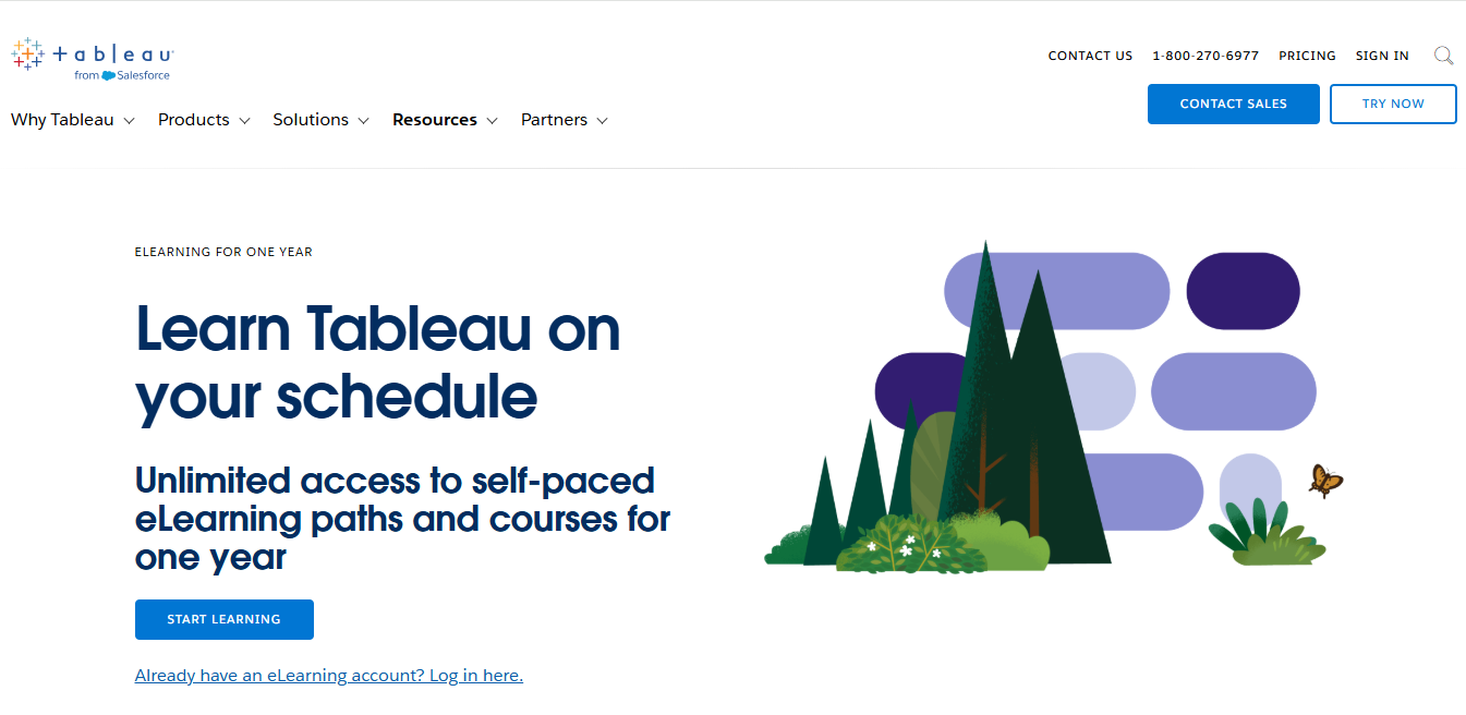
Tableau
Tableau is a powerful data visualization tool designed to transform raw data into interactive and insightful dashboards. Its key features include drag-and-drop functionality, advanced analytics, real-time data updates, and seamless integration with multiple data sources. Best suited for businesses, analysts, and decision-makers, Tableau excels in presenting complex data in an easily digestible format. With its user-friendly interface and robust capabilities, it empowers organizations to make data-driven decisions efficiently.
Microsoft Power BI
Microsoft Power BI is a leading data visualization tool that enables users to create interactive dashboards and reports with ease. Its key features include AI-powered analytics, real-time data updates, seamless integration with Microsoft tools like Excel, and a vast array of data connectors. Ideal for businesses and professionals, Power BI simplifies complex data and enhances decision-making. Its affordability, scalability, and user-friendly interface make it a go-to solution for data-driven insights.

Excel
Excel is a versatile tool for data visualization, offering features like charts, graphs, pivot tables, and conditional formatting to represent data effectively. Best suited for professionals, students, and businesses, it provides a user-friendly platform to analyze and visualize data. With its extensive customization options, compatibility with other tools, and widespread accessibility, Excel remains a reliable choice for creating clear and impactful data visualizations.

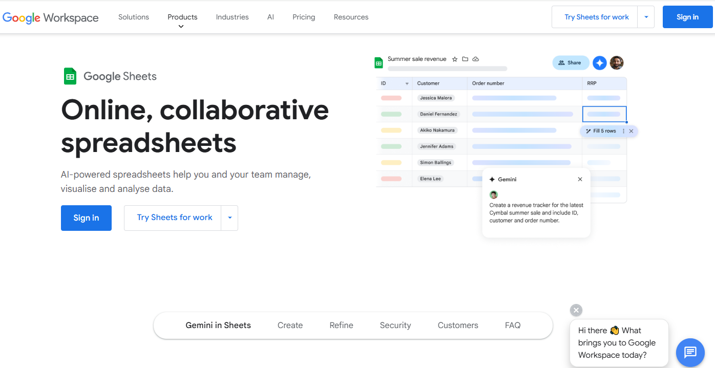
Google Sheets
Google Sheets is a cloud-based tool for data visualization, offering features like customizable charts, pivot tables, and collaborative editing. Best suited for teams, educators, and small businesses, it allows real-time collaboration and seamless integration with other Google Workspace tools. With its accessibility, ease of use, and ability to handle basic to moderately complex data tasks, Google Sheets is an excellent choice for creating and sharing interactive visualizations online.
Qlik Sense
Qlik Sense is a robust data visualization tool designed for interactive data exploration and business intelligence. Its key features include self-service data analytics, associative data indexing, drag-and-drop visualization, and advanced analytics capabilities. Best suited for enterprises and data analysts, Qlik Sense empowers users to discover insights through intuitive, customizable dashboards. With its powerful data integration, scalability, and user-friendly interface, Qlik Sense enables data-driven decision-making and enhances organizational agility.

Python with Matplotlib and Seaborn
Python, paired with Matplotlib and Seaborn, is a powerful combination for data visualization, offering flexibility and customization for creating static, animated, and interactive charts. Key features include the ability to plot a wide range of visualizations, from simple graphs to complex statistical plots, and the integration of advanced features for customization. Best suited for data scientists, analysts, and researchers, this toolkit enables detailed visual analysis through its rich library ecosystem. With its open-source nature, extensive documentation, and ability to handle large datasets, Python with Matplotlib and Seaborn is ideal for in-depth, tailored visualizations.

R with ggplot2
R, with the ggplot2 package, is a highly effective tool for data visualization, known for its powerful grammar of graphics approach to creating complex plots. Key features include the ability to layer visual elements, create customizable plots, and work seamlessly with statistical data. Best suited for statisticians, data scientists, and researchers, ggplot2 allows for detailed, high-quality visual representations. Its flexibility, extensive customization options, and strong integration with R’s data analysis capabilities make it an ideal choice for creating publication-ready visualizations.
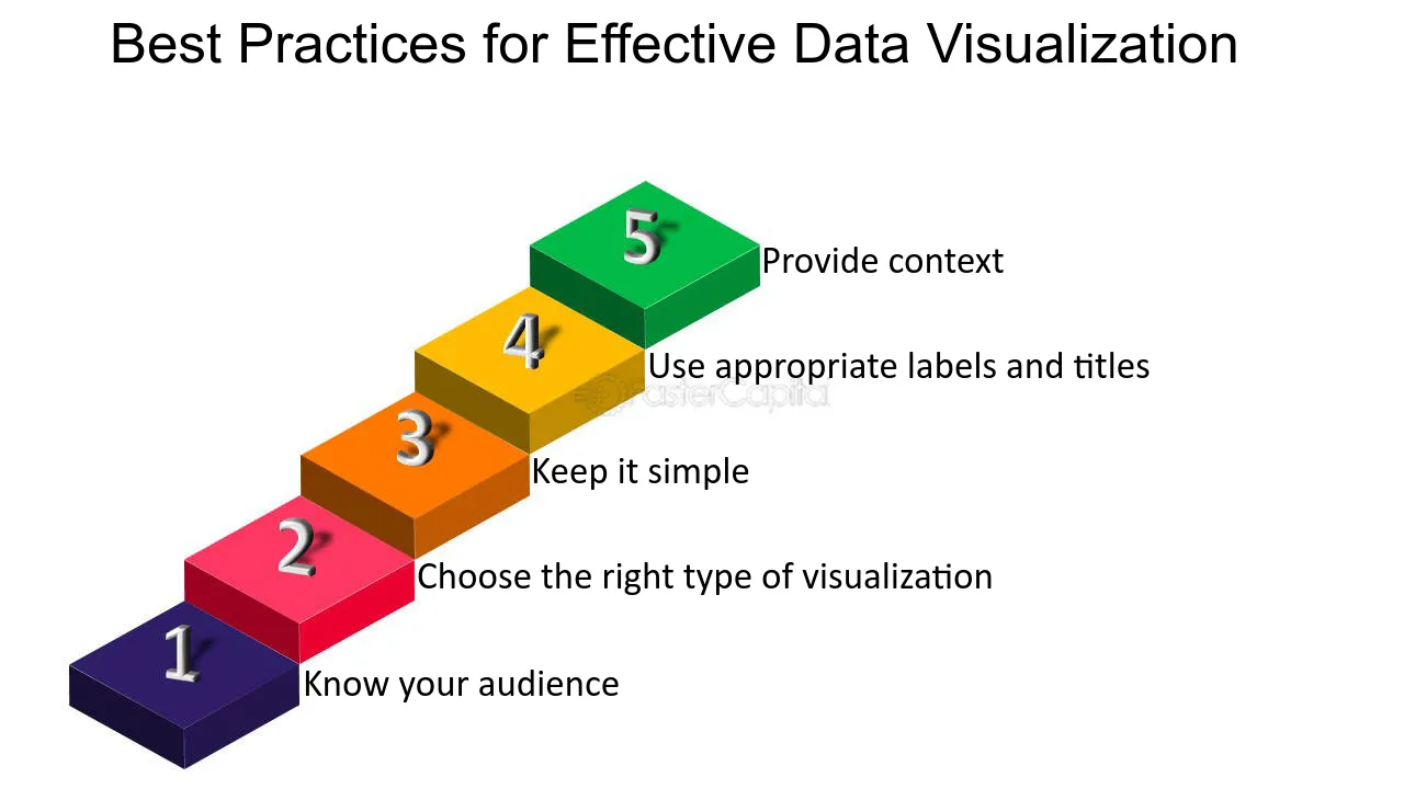
Best Practices for Effective Data Visuals
No matter which tool you choose, follow these tips to create visuals that leave an impact:
Focus on Clarity: Avoid clutter and keep the design simple.
Highlight Insights: Use colors, labels, and annotations to draw attention to key data points.
Incorporate a Narrative: Use visuals to support your story and guide the audience.
Test and Refine: Gather feedback and make adjustments for maximum impact.
Why Invest in High-Quality Data Visuals?
High-quality visuals do more than just present data; they:
- Build credibility by showcasing professionalism.
- Enhance engagement by simplifying complex ideas.
- Drive decisions by presenting actionable insights.
Conclusion
Data visualization is no longer a luxury—it’s a necessity in today’s data-driven world. With the right tools, anyone can transform raw data into compelling visuals that inspire action. Whether you’re a beginner or an expert, there’s a tool that fits your needs perfectly.
Start exploring these top data visualization tools, and watch your presentations come alive!