Repurpose blog posts into infographics

Table of Contents

If you’ve been running a blog for a while, chances are you’ve got a treasure chest of content sitting there collecting digital dust. Some of those blog posts might have done well when you first published them, but now they’re buried under newer articles. Others might still get the occasional hit but don’t quite have the same shine anymore.

Here’s the thing: your old blog posts are not dead weight. They’re hidden assets just waiting to be rediscovered. One of the smartest ways to breathe life back into them is to repurpose blog posts into infographics. Infographics aren’t just pretty visuals—they’re storytelling machines. They take your written words, numbers, and insights, and package them into something your audience can grasp in seconds.

Studies show that 94% of marketers believe repurposing content works for them, while the other 6% are planning to do it in the future. Infographics, in particular, are powerful because they’re visually appealing, highly shareable, and up to 3 times more likely to be shared on social media than other types of content. They also improve comprehension—research suggests that visuals can boost reading comprehension by nearly 50%.

So if you’ve been wondering how to make your old blog posts work harder for you, this guide is for you. Let’s dive into five creative ways to repurpose blog posts into infographics—with practical examples and strategies you can start using today.

At first glance, infographics and data reports might seem like two sides of the same coin. After all, both rely on data, and both are tools to share information. But the truth is, they’re designed for completely different communication goals. Infographics are all about speed, engagement, and storytelling, while data reports dive deep into analysis, accuracy, and decision-making. Understanding the difference can be a game-changer for your business, whether you’re pitching to investors, reporting performance to stakeholders, or sharing insights with a wider audience.

Why Repurpose Blog Posts into Infographics?

Before we get into the “how,” let’s talk about the “why.” Repurposing is about efficiency—it’s taking content you’ve already created and extending its reach by putting it into a fresh format. Instead of starting from scratch, you’re giving your ideas a second (or third) life.

Infographics in particular tick all the right boxes:

Easy to consume: People love skimmable, visual content.

Great for engagement: Infographics feed short attention spans while still delivering value.

Boost SEO: Embedding an infographic into an old blog post can help improve time-on-page and lower bounce rates.

Highly shareable: Platforms like Pinterest, LinkedIn, and Instagram thrive on visuals.

Perfect for storytelling: Whether it’s a process, a comparison, or data-heavy stats, infographics make it digestible.

Think about it—if you had a detailed blog on “The Evolution of Mobile Marketing,” you could turn it into a timeline infographic. Or if you wrote about “10 SEO Tips,” those could instantly become a step-by-step vertical design that’s way easier to share.

1. Turn Listicles into Visual Step-by-Step Guides

Listicles are one of the most common blog formats, and for good reason—they’re easy to read and packed with value. But let’s be honest, a list with ten points can still feel heavy when it’s all text. That’s where infographics come in.

When you repurpose blog posts into infographics, especially list-based ones, you can transform them into a step-by-step visual guide. Instead of paragraphs of explanation, you’re giving your audience a clean design with icons, short text snippets, and a logical flow.

Example:Say you wrote a blog post called “10 SEO Tips for Beginners.” You could design a vertical infographic where each tip is paired with an icon—like a magnifying glass for keyword research or a chart for analytics. Suddenly, your blog is now a handy checklist people can save, share, and even pin.

This method also works beautifully for tutorial-type content. If you wrote a guide on “How to Build a Content Calendar,” that can easily become a roadmap infographic with arrows leading from one step to the next.

2. Convert Data-Heavy Articles into Charts and Graphs

Got a blog full of stats, survey results, or case studies? Perfect. Data can be powerful, but most people glaze over when faced with a wall of numbers. Infographics are the solution—they let you transform numbers into visuals like bar charts, pie graphs, or heat maps.

Why it works:

  • Numbers are persuasive, but visuals are memorable.
  • Infographics give stats a “wow factor” that plain text can’t.
  • Visuals can simplify trends, making them easier to understand at a glance.


Example:If you’ve written a blog titled “2023 Social Media Statistics That Marketers Need to Know,” you could extract the key numbers—like “Instagram engagement rates grew by 30%” or “LinkedIn drives 80% of B2B leads”—and put them into a clean infographic. This not only makes your content more engaging but also increases the likelihood that other blogs will link back to your infographic as a reference (hello, backlinks!).

3. Summarize How-To Guides into Infographic Roadmaps

How-to posts are fantastic for SEO, but let’s face it—they’re often long and detailed. Readers might appreciate the depth, but not everyone has the time to scroll through 2,000 words. That’s where an infographic roadmap comes in handy.

When you repurpose blog posts into infographics, you can take a long tutorial and condense it into a roadmap or flowchart infographic.

Example: Imagine you wrote a blog called “How to Launch a SaaS Product.” You could condense it into an infographic roadmap:

  • Validate your idea
  • Build an MVP
  • Create a SaaS explainer video
  • Onboard early adopters
  • Scale marketing efforts


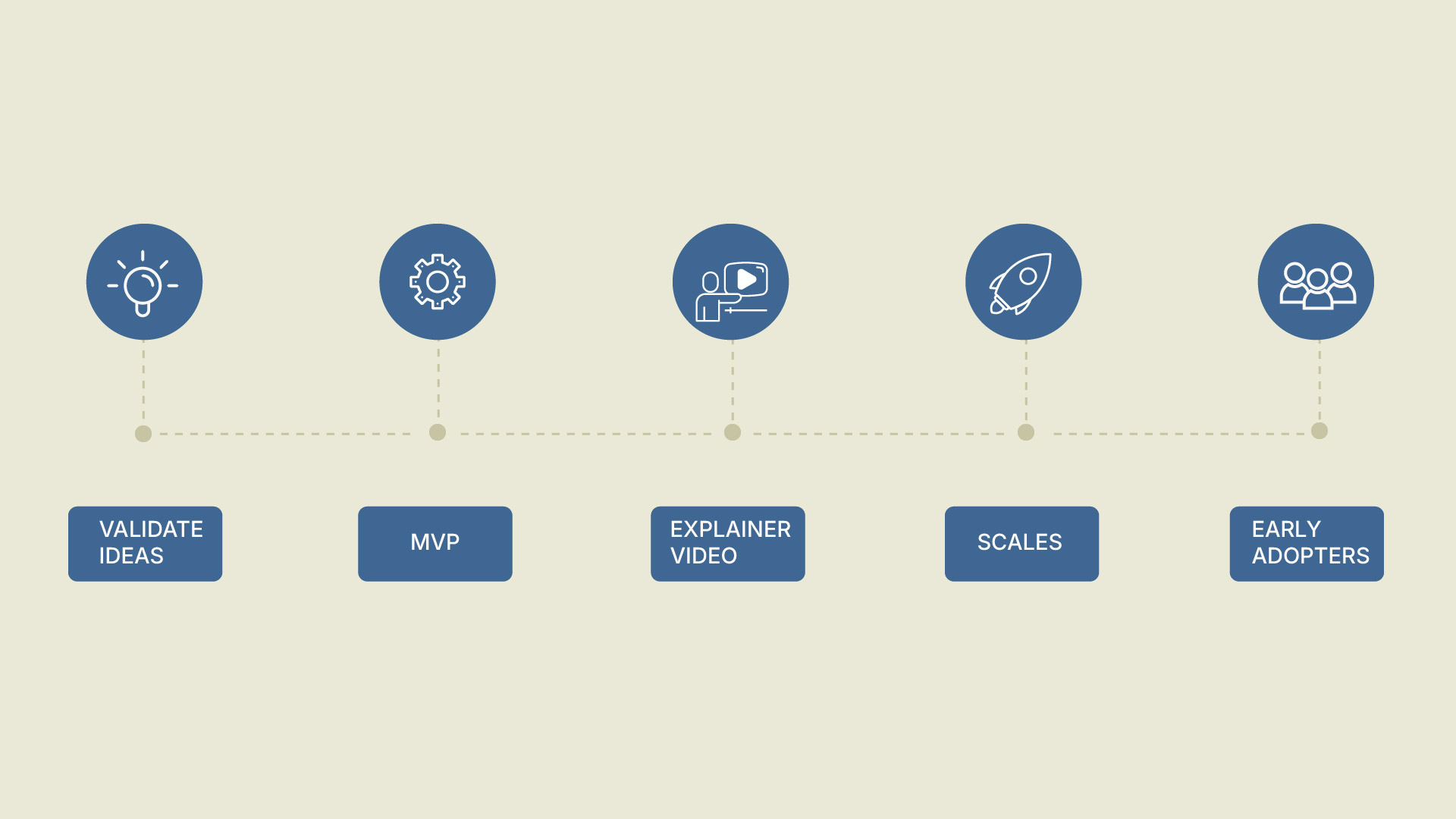
Not only is this easier to digest, but it’s also a powerful lead magnet. People love saving checklists and roadmaps for later.

4. Compare Ideas with Infographic Side-by-Side Comparisons

Comparison blogs are incredibly popular because readers want help making decisions. Think of posts like “Animated vs. Live-Action Videos” or “WordPress vs. Wix.” But while text-based comparisons can be informative, they’re not always easy to skim.

This is where infographics shine. A side-by-side infographic lets readers see pros and cons at a glance.
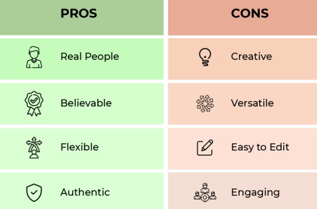
 

Example:
If you had a blog comparing “Animated vs. Live-Action Explainer Videos,” you could repurpose it into a split-screen infographic:

On the left: Benefits of animated (cheaper, flexible, great for SaaS explainer videos).

On the right: Benefits of live-action (personal, authentic, good for B2B explainer videos).

This format is highly shareable on social media, and it also doubles as sales collateral—you can use it in pitches, decks, or email campaigns.

5. Create Infographic Timelines from Historical Posts

Do you have content that talks about history, growth, or evolution? Those blogs are prime candidates for timeline infographics. People love seeing progress visually.

Example: If you wrote a post like “The Evolution of Mobile Marketing,” you could turn it into a timeline infographic showing milestones from 2010 to 2025. Each year could include a simple icon and a key milestone—like the rise of mobile-first indexing or the dominance of short-form video.

Timelines are also great for case studies. If your company wrote a blog about its own growth, you could repurpose it into a branded timeline infographic that doubles as a PR tool.

When to Use Infographics

Infographics shine when the goal is communication rather than analysis. If you need to capture attention, make data memorable, and ensure the message resonates quickly, an infographic is your best bet. They’re especially useful in marketing, public awareness campaigns, and education, where a broader audience needs to grasp the message without getting lost in the details.

Infographics are also designed to be shareable. A well-designed infographic can spread across social media, presentations, or newsletters, engaging audiences who might not have the time or interest to dive into a lengthy report. They guide the audience through a premeditated narrative, ensuring the takeaway is both clear and impactful.

For instance, a SaaS company might use an infographic to showcase how its product improves efficiency by 60%. The same company would use a data report internally to analyze customer retention, feature usage, and financial performance. Both formats are valuable, but the context defines which one works best.

Choosing the Right Infographic Style and Tools to Repurpose Blog Posts

Here’s the thing—not every infographic should look the same. The format you choose should always match the type of content you’re repurposing. Think of it like pairing the right outfit with the right occasion—it just works better.

  • Listicle blogs → Step-by-step guides
    If your blog is structured as a list of tips or steps, a vertical infographic with icons and numbered sections works perfectly. It helps readers quickly follow the flow in order.
  • Data-heavy blogs → Charts & graphs
    Blogs packed with statistics or survey findings can shine when turned into bar charts, pie charts, or data visualizations. Numbers hit harder when shown visually.
  • How-to blogs → Roadmaps or flowcharts
    Tutorials and instructional posts translate beautifully into infographic roadmaps. Arrows, steps, and flowcharts make complex processes easy to digest.
  • Comparison blogs → Side-by-side split infographics
    If you’ve written a “this vs. that” type of post, a split infographic works wonders. Each side highlights pros and cons so readers can compare at a glance.
  • Historical blogs → Timelines
    When your blog tracks progress over time—like the history of a trend—a timeline infographic is the perfect match. It makes the story linear and easy to follow.

The key takeaway? Matching the infographic style with the content type ensures clarity, boosts engagement, and keeps your audience hooked.

And here’s the best part—you don’t have to be a professional designer to create them. Tools like Canva, Piktochart, Venngage, and Adobe Express give you ready-made templates for each format.

Pro tip: If you want to take it a step further, partner with an explainer video company. They can turn your static infographic into a 2D animated explainer video or a custom explainer video—making your repurposed content even more dynamic and shareable.

Where to Share Your Infographics for Maximum Impact

Creating your infographic is just half the job—you need to put it where your audience will see it. Some of the best places include:

  • Social media platforms: Pinterest, LinkedIn, and Instagram thrive on visuals.
  • Your blog: Update old posts by embedding the infographic for better engagement and SEO.
  • Email campaigns: Infographics make for powerful lead-nurturing content.
  • Slide decks or webinars: Repurposed visuals can also work as presentation slides.


Example:HubSpot frequently repurposes old content into infographics and embeds them back into their evergreen blog posts. This not only improves engagement but also helps them generate new backlinks whenever other sites use their visuals as references.

Measuring the Success of Your Repurposed Infographics

If you’re going to invest time and effort in turning old blog posts into infographics, you need to make sure the results are worth it. The good news? Infographics are one of the easiest types of content to measure because their impact shows up across multiple channels. Here’s what to track:

1. Engagement Metrics

Think likes, shares, comments, and saves on social media. Infographics are designed to be snackable and shareable, so these numbers often spike compared to text-only content.
Example: A standard blog post may get 10 shares on LinkedIn, but the same content repurposed into an infographic could generate 100+ shares because it’s easier to consume at a glance.

2. Website Traffic

Embedding infographics back into your blog doesn’t just make it prettier—it improves performance. Check your analytics to see if time on page increases, bounce rates drop, or if the blog gets more repeat visitors.

Example: A blog that used to attract 300 monthly views can jump to over 2,000 when a well-designed infographic is added, simply because it’s more engaging and gets re-shared.

3. Backlinks and SEO Value

Infographics are link magnets. When other blogs or media outlets reference your visual, they often link back to your site as the source. More backlinks = stronger domain authority = better SEO rankings.

Pro tip: Always add an embed code or a “Share This Infographic” CTA so people can easily link back to you.

4. Conversions and Lead Generation

At the end of the day, it’s not just about pretty visuals—it’s about results. Track whether infographics encourage readers to take the next step, like downloading a resource, signing up for a newsletter, or booking a demo.

Example: A SaaS company repurposing a technical blog into an infographic might see a 20% increase in demo requests because the visual version made the benefits easier to understand.

5. Long-Term Content Lifespan

Unlike social posts that disappear in 48 hours, infographics often stay relevant for months (or even years). Monitor whether older blogs start performing better over time after you’ve added visuals.
Bottom line: A well-crafted infographic doesn’t just make your content prettier—it gives your blog a second life, boosts visibility across platforms, and delivers measurable ROI.

Mistakes to Avoid When Repurposing Blog Posts into Infographics

Infographics are powerful, but they only work when executed the right way. One of the most common mistakes is overloading them with text. Remember, the whole point of an infographic is to simplify information—less is always more. Another trap is ignoring design quality. Even if your content is strong, a poorly designed infographic can instantly make it look unprofessional and reduce its impact.

Branding is another area many creators overlook. Every infographic you publish should carry your logo, fonts, and colors so that your audience instantly connects it back to your brand. Finally, don’t forget about mobile optimization. A large percentage of your audience will view infographics on their phones, and if the design isn’t mobile-friendly, you’ll lose engagement quickly.

The bottom line is this: a successful infographic blends clarity, design quality, and brand consistency while being accessible across all devices.

Final Thoughts: Refresh, Don’t Rewrite

Repurposing content is not about starting over—it’s about working smarter. When you repurpose blog posts into infographics, you’re amplifying your ideas, reaching new audiences, and squeezing more value out of content you’ve already created.

Infographics give your readers a shortcut to understanding, while giving you the chance to showcase expertise in a highly shareable format. So dust off those old blog posts, choose the right infographic style, and start creating visuals that engage, educate, and convert.

Unlock the power of captivating visuals with our seasoned expertise! With 7 years of crafting compelling visual content, we’re ready to elevate your brand’s story. From stunning graphics to mesmerizing animations, we bring your vision to life. Let’s create engaging visuals that resonate with your audience and leave a lasting impression. Partner with us today for an unforgettable visual journey! 

Check out our work.