Infographics Video Mistakes Every Designer Should Know

Infographics Video Mistakes Every Designer Should Know

Table of Contents

In today’s digital world, visual content isn’t just a nice-to-have—it’s the king. People scroll, swipe, and click faster than ever before, and if your message isn’t eye-catching, it gets lost in the noise. That’s why infographics explainer videos have become such a powerful content tool. They combine storytelling, statistics, and visuals into a single, snackable video format.

But here’s the problem: not all infographic videos are created equal. In fact, many fail to deliver because of a handful of avoidable errors. If you’re putting in time, budget, and creativity to make one, dodging these infographics video mistakes can be the difference between a video that goes viral—and one that gets ignored.

Let’s break down the common mistakes people make when creating an infographics video and how to avoid them.

What Is an Infographics Video, Anyway?

An infographics video is basically a moving infographic—think of it as your favorite data-packed poster, but way more dynamic and easier to digest. It’s a short, animated video that uses icons, charts, numbers, illustrations, and voiceover to present complex information in a visual, engaging format.

Instead of dumping a wall of text on your audience, you’re guiding them through the content in a way that’s entertaining and educational.

These videos are super popular with businesses looking to explain processes, summarize reports, or break down research. Whether you’re showing how your SaaS platform helps reduce churn, or reporting 2024 market trends, infographics videos make it visual, clear, and fun to watch.

Why Infographics Videos Matter in Digital Marketing

In a world where attention spans are shorter than ever (some say even less than a goldfish’s—ouch), visuals are your secret weapon. And when those visuals are animated? Even better.

Here’s why infographics videos pack such a punch in digital marketing:

  • They simplify the complex: Got a dry annual report or a boring technical process? Animate it. Visual storytelling makes boring stuff feel bite-sized.
  • They boost engagement: Social media algorithms love video. An infographic video can skyrocket your engagement rates compared to static posts.
  • They improve retention: People remember 80% of what they see and do—but only 20% of what they read. So if you want your stats to stick, make them move.
  • They build authority: Presenting accurate, well-designed visuals backed by data makes your brand look professional and trustworthy.
  • They’re shareable: A short, well-made infographic video is a dream on platforms like LinkedIn, Twitter, and even Instagram Reels.

Bottom line? Whether you’re a startup, a marketing agency, or a B2B brand, using infographics videos in your content mix can elevate your strategy—and your results.

Common Mistakes with Infographics Video

1.Overloading the Screen with Too Much Data


We get it—you’ve got a ton of stats, charts, and facts to show off. But stuffing them all into a 60–90 second infographic video? Not a good look.

Infographics work because they simplify complex ideas into digestible visuals. But when you throw in paragraph-long text and dozens of figures, your audience will tap out fast. Nobody wants to pause every two seconds to process a wall of information.

Pro Tip: Stick to one idea or statistic per scene. Let each visual breathe, and give your viewer time to absorb the data before you move on.

2. Neglecting a Story or Logical Flow

Guide viewers CTA

This is one of the sneakiest infographics video mistakes out there—turning your video into a jumbled slideshow of unrelated stats.

Even if you’re presenting data, it should still follow a narrative arc. Start with a problem, offer some insights, and end with a clear takeaway or call to action.

Imagine watching a SaaS explainer video that jumps from customer pain points to company milestones to product features in no logical order. Confusing, right?

Pro Tip: Think of your infographic video like a mini-story. Use transitions and voiceovers to guide the viewer from beginning to end smoothly.

3. Making It Too Wordy (Seriously, Cut That Text!)

An infographics video isn’t a blog post in motion—it’s a visual journey. One of the biggest reasons infographics are so popular is because they give people a fast, visual way to learn.

If your video makes viewers read more than they watch, you’ve missed the point. Too much text forces people to focus on reading instead of absorbing the visuals, killing engagement.

Pro Tip: Use short, punchy text. Pair it with icons, charts, and animations that reinforce the message instead of repeating it.

4. Using Outdated or Inaccurate Data

Nothing undermines your authority like citing a stat from 2012 or misquoting a source. Your audience is smart—and quick to fact-check.

If you’re creating an infographics explainer video about rising eCommerce trends or medical research, your data needs to be recent and accurate. Otherwise, you’re giving off amateur vibes—and your bounce rate will show it.

Pro Tip: Only use statistics from trusted, verifiable sources. If you’re quoting a number about road accidents, use the latest government or academic data. Bonus: link to the source in your video description.

5. Cloning What Everyone Else Is Doing

Sure, there’s plenty of inspiration online—but copying another brand’s video frame for frame? You’ll only succeed in boring your audience.

Rehashed visuals and overused templates don’t just make your brand look lazy—they make it forgettable. Everybody’s seen that stock rocket-launch animation by now. Time to innovate.

Pro Tip: Customize your video to reflect your brand’s personality. Whether you’re creating a B2B explainer video or a fun product demo, fresh visuals will set you apart.

6. Poor Use of Color (Yes, It Matters a Lot)

Think of color like seasoning in food: just enough enhances the flavor; too much ruins the dish.

When designers get carried away spinning the color wheel, the result is visual chaos. Using 10 different colors in one frame makes it hard to focus—and even harder to retain info.

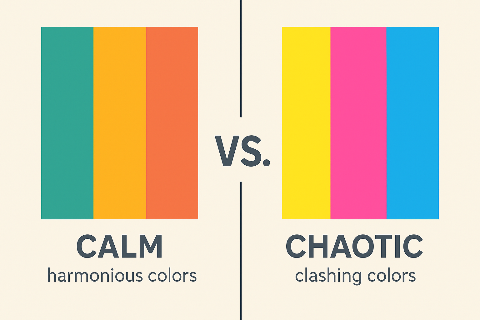
Pro Tip: Stick to 2–3 primary colors that align with your brand. Use contrast to highlight key points, but don’t blind your audience.

7. Overcomplicating the Design

Sometimes, more isn’t better. Cramming in 15 different icons, pie charts, animations, and background elements will only give your viewer a headache.

Complex information already takes effort to process. Your job is to simplify it—not bury it under layers of visual noise.

Pro Tip: Use white space generously. It helps isolate key elements and keeps your video clean and easy to follow.

8. Creating a Video That’s Way Too Long

Yes, your infographic video is awesome. But if it’s over 3 minutes, you might be losing half your audience by the 90-second mark.

Lengthy videos packed with stats tend to feel like homework—people will drop off fast. This is especially true in mobile-first environments.

Pro Tip: Keep your video under 2 minutes. If you must go longer, make sure the pacing and visuals change frequently to maintain interest.

9. Ignoring File Size and Technical Specs

This one’s underrated. Uploading a heavy video file (say, 5MB or more) can kill loading speed, especially on mobile.

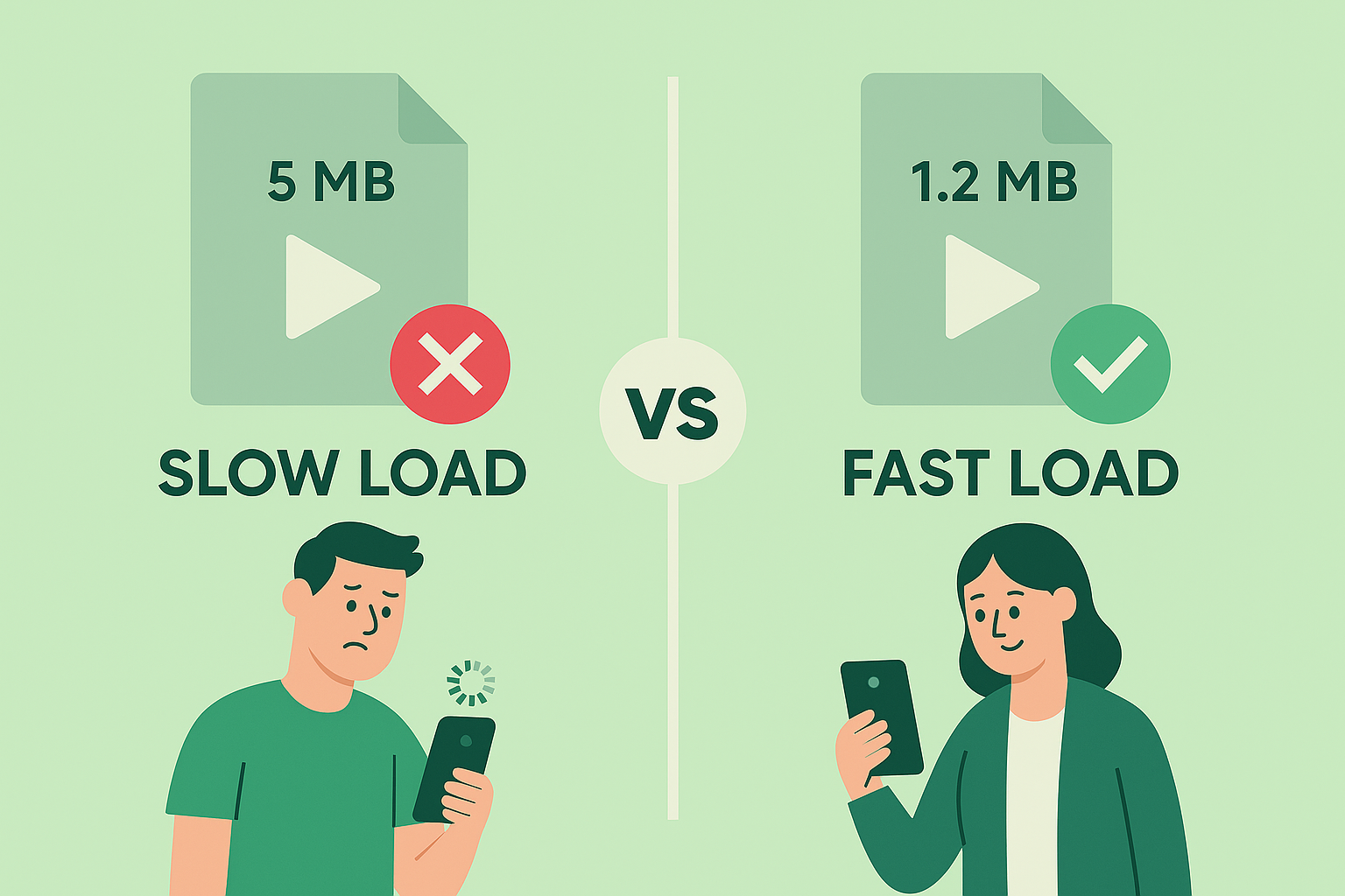
Remember: if your video doesn’t load fast, it might not load at all. And that means lost views, lost engagement, and lost conversions.

Pro Tip: Stick to under 1.5 MB for web delivery and avoid going beyond 8,000 pixels in length. Tools like HandBrake can compress video without major quality loss.

10. Forgetting the Call to Action (CTA)

You’ve put in the hours. Script written, stats animated, voiceover crisp. The audience watches your beautifully crafted infographics explainer video all the way to the end—and then… silence.No direction. No link. No next step.This, my friend, is a common mistake that can tank your conversion rate. All that effort and storytelling, wasted—because you didn’t tell the viewer what to do next.A well-made custom explainer video or 2D animated explainer video isn’t just a visual treat—it’s a conversion tool. Your CTA (Call to Action) is the moment of truth. It guides your viewer toward your goal—be it subscribing, booking a demo, downloading a report, or checking out your pricing page.

What makes a CTA effective?

It’s clear: No ambiguity. “Sign up now.” “Visit our website.” “Download the free guide.”
  • It’s timely: Drop it at the end of your video, when engagement is highest.
  • It’s reinforced: Repeat it in your video description and on your landing page.
  • It’s visually supported: Use icons, buttons, or motion graphics to draw attention to it.

Pro Tip: Use your voiceover artist to say the CTA aloud, while the animation visually backs it up. A subtle sound cue or motion arrow can also help point users in the right direction. Don’t be shy—if you don’t ask, they won’t act.A good CTA turns a viewer into a lead. A great CTA turns them into a customer.

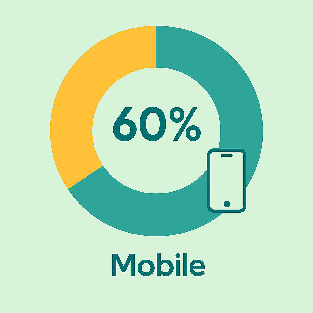
11. Not Optimizing for Mobile Viewers

Let’s be real: Most people are watching your video on a phone—probably while multitasking. Stats show that over 60% of video content is consumed on mobile devices, yet too many designers still think like it’s 2010.

Designing your infographics video with only a desktop view in mind is a huge mistake. If your text is too small or your animations are cluttered, your message won’t land—and your viewer will bounce.

Remember, mobile screens are smaller and attention spans are shorter. If your audience has to zoom in or guess what’s on the screen, they’re gone.

Here’s how to make your infographic video mobile-friendly:

  • Use large, legible fonts: If they can’t read it on a 6-inch screen, it’s useless.
  • Keep visuals bold and simple: Avoid overly detailed graphs or intricate icon sets.
  • Stick to high contrast: Black on white, white on navy, or bold brand colors that stand out.
  • Preview it: Always test your video on an actual phone—not just in editing software.

Pro Tip: Design in a vertical or square format (9:16 or 1:1) if you’re creating for Instagram Reels, TikTok, or LinkedIn Stories. Landscape videos work well on YouTube, but not so much on mobile-first platforms.

By prioritizing mobile optimization, you’re not just improving user experience—you’re dramatically increasing the chances that your content will be seen, understood, and acted upon.

12. Skipping the Script and Storyboard

Jumping straight into animation without a plan? Big no-no.

Even the best explainer video company starts with a detailed script and storyboard. This ensures the visuals, pacing, and voiceover work together instead of clashing.

Pro Tip: Write your script first. Then sketch a rough storyboard or flowchart before heading into production.

13. Using Robotic or Monotone Voice Overs

Your voiceover is the soul of your infographic video. A robotic voice or flat tone can suck the energy out of even the most beautiful visuals.

Viewers connect with real, human-sounding voices. It helps them stay engaged and builds trust.

Pro Tip: Invest in a professional voiceover artist or use AI voice tools with natural, expressive tones.

14. Not Reviewing the Final Output

You’d be surprised how many videos go live with spelling mistakes, clunky transitions, or off-timed animations.

It only takes one typo to damage your credibility. Or one awkward cut to make your message fall flat.

Pro Tip: Watch your video multiple times on different devices. Get feedback from a few team members or even outside your company. Fresh eyes catch mistakes fast.

15. Forgetting the Power of Originality

Creating an awesome infographic video doesn’t mean copying what already exists. It means understanding your audience, crafting your story, and using motion design to bring it to life.

Use quotes, unusual stats, and data visualizations that feel fresh. Hire from the best explainer video companies if needed, or work with freelancers who understand your brand’s voice.

Pro Tip: Don’t just copy what’s trending. Use it as inspiration—and then add your own twist.

Conclusion: Do Infographics Videos Right—and Reap the Benefits

There’s no doubt that infographic videos can supercharge your content strategy. They’re short, informative, engaging, and incredibly shareable. But only if you do them right.

By avoiding these infographics video mistakes, you put yourself miles ahead of the competition. You keep your audience engaged, build credibility, and increase your chances of going viral—or at least being remembered.

So, the next time you plan a 2D animated explainer video, remember: visuals matter, but clarity matters more. Design smart, write sharp, and deliver value.

Unlock the power of captivating visuals with our seasoned expertise! With 7 years of crafting compelling visual content, we’re ready to elevate your brand’s story. From stunning graphics to mesmerizing animations, we bring your vision to life. Let’s create engaging visuals that resonate with your audience and leave a lasting impression. Partner with us today for an unforgettable visual journey! 

Check out our work.